
If you are not tracking the right ATS metrics, hiring delays will cost you time, money, and accepted offers.
For scaling teams in SaaS, Technology, IT, Fintech, Engineering, Security, Insurance, and Professional Services, five numbers matter most: time to hire, quality of hire, offer acceptance rate, pipeline conversion rates, and source of hire. Together, they show where your process is slow, where quality slips, and which channels are worth your budget. In the US, average time to fill sits at 42 days, so small delays can turn into lost hires fast.
Here is the short version:
- Time to hire shows where your process stalls
- Quality of hire shows if new joiners perform and stay
- Offer acceptance rate shows if your offers are strong enough
- Pipeline conversion rates show where your funnel breaks down
- Source of hire shows which channels give you hires, not just applicants
A simple ATS dashboard should help you cut waste, save recruiter and hiring manager time, and make hiring outcomes easier to track. That is the lens for the rest of this article.
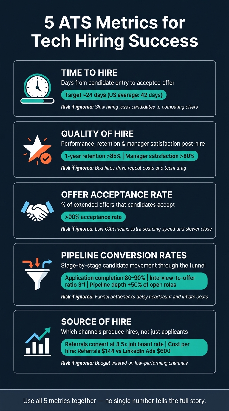
5 ATS Metrics for Tech Hiring: Benchmarks & Business Impact
Quick Comparison
| Metric | What it checks | Business impact |
|---|---|---|
| Time to Hire | Hiring speed from entry to accepted offer | Lost candidates, delayed headcount, more interview admin |
| Quality of Hire | Performance, retention, manager feedback | Bad hires, repeat hiring costs, team drag |
| Offer Acceptance Rate | % of offers accepted | Offer declines, extra sourcing spend, slower close |
| Pipeline Conversion Rates | Movement from one stage to the next | Funnel waste, weak screening, interview load |
| Source of Hire | Which channels lead to hires | Budget waste, high cost per hire, weak channel mix |
If you want a hiring team that moves with more control and less waste, these are the metrics to watch first.
sbb-itb-a23bd6a
Why ATS Metrics Matter for Tech Hiring
Hiring for technical roles in competitive markets is tough. Engineering talent is in short supply, top candidates often juggle multiple offers, and interview feedback can come in too late. When you don’t have clear data, your team is left making calls on instinct. That can cost you strong candidates and slow down growth.
ATS metrics give you something better than guesswork. They show where the hiring process gets stuck, which channels bring in the right people, and whether new hires actually work out over time. You can also rate your recruitment process to identify specific gaps in your strategy.
No single metric gives you the full picture. You need to look at them together if you want to understand the whole funnel.
In tech hiring, small delays have a big cost. A slow interview loop can be enough to lose a candidate to another offer.
Use ATS metrics to spot problems, not to chase one number. Start with Time to Hire, the clearest way to measure hiring speed.
1. Time to Hire
Time to hire tracks the number of days from the moment a candidate enters your pipeline, either by applying or being sourced, to the point they accept your offer. Most ATS platforms calculate this using stage timestamps such as application, screening, interviews, offer, and acceptance.
This only means anything if your business uses one clear definition across every role. If one team starts the clock at application and another starts it at first recruiter contact, the number stops being useful.
In SaaS, Technology, IT, Fintech, Engineering, Security, Insurance, and Professional Services, hiring timelines can stretch fast. Technical roles often take weeks, and senior or niche roles usually take longer.[4][5] That matters because slow hiring has a direct cost. You lose momentum, managers stay tied up in interviews, and good candidates drop out.
The top-line number tells you if hiring is slow. Stage-level timing tells you what to fix.
If candidates move through sourcing and screening quickly but then sit idle before a final decision, your issue probably is not sourcing. It is more likely tied to offer approvals or poor alignment with the hiring manager. When one stage keeps lagging behind the rest, that is the part of the process you need to inspect.[3]
For scaling SMEs hiring for several technical roles at the same time, keep it simple. Run a weekly check of open roles and stalled stages in your ATS dashboard. Then put a few basic controls in place:
- Set a fast feedback target for interviewers
- Use automated reminders to move reviews along
- Flag any candidate stuck in one stage for more than five days
Used well, time to hire gives you a straight read on hiring speed. From there, you can check whether moving faster still leads to strong hiring outcomes.
2. Quality of Hire
Quality of hire tells you what a new hire delivers after they join, not just whether you filled the seat.
That matters because speed on its own is not enough. You can cut time-to-hire, but if new joiners underperform or leave inside 12 months, the business still pays for it. This is why quality of hire is an outcome metric, not a funnel metric.
To track it properly, sync your ATS data with HRIS outcomes like performance, retention, and manager feedback. For tech roles, the most useful measures are:
- First-year performance ratings
- One-year retention rate
- Hiring manager satisfaction scores
A retention rate above 85% after year one is a strong sign that your screening and selection process is doing its job. Hiring manager satisfaction should also sit at 80% or higher to show that recruiters and hiring managers are aligned on candidate quality.[1]
When quality of hire drops, the problem usually starts earlier in the process. Poor screening, unclear role expectations, misalignment between recruiters and hiring managers, or weak onboarding can all show up later as low retention or poor performance.
There’s another signal worth watching. If your interview-to-offer ratio is above 3:1, your pre-interview screening may not be filtering well enough.[1] That creates extra interview load, slows hiring teams down, and drives up cost per hire.
Track these signals early. Then tie them back to hiring decisions, so you can see what’s working, what’s not, and where hiring quality starts to slip. Once you know whether hires are working out, check whether candidates are also accepting your offers.
3. Offer Acceptance Rate
Offer acceptance rate (OAR) shows the share of offers you send that candidates accept. Your ATS works it out by dividing offers accepted by offers extended.[1]
A healthy OAR sits above 90%. If you stay below that mark, look hard at compensation, benefits, employer brand, and how fast you move from final interview to offer.[1]
This matters because a weak acceptance rate adds cost, slows hiring, and forces your team back into the market for roles you thought were closed.
Once OAR is in a good place, shift your focus to drop-off before offer stage. That’s often where time gets lost and hiring teams feel the drag most.
Use ATS survey feedback to spot friction early. Aim for a candidate experience score above 80%.[1]
| Signal | Healthy Benchmark | What It Tells You |
|---|---|---|
| Offer Acceptance Rate | >90% | Attractiveness of salary, benefits, and reputation [1] |
| Candidate Experience Rating | >80% | Whether the hiring process is deterring top talent [1] |
If acceptance is strong but hiring still feels slow, the issue usually sits earlier in the funnel.
4. Pipeline Conversion Rates
Pipeline conversion rates show how people move through your hiring funnel, from application to screening, interview, offer, and hire. Your ATS makes this visible. You can see where people move forward and where they fall away. If offer acceptance is strong but hiring is still slow, this is often the metric that shows you where the process is stuck.
For scaling tech teams, this matters because a busy pipeline can still be a weak one. Volume alone does not mean your hiring engine is working. Stage-by-stage conversion helps you spot bottlenecks early, before delays hit headcount plans or push teams off target.
Track these three benchmarks [1]:
- 80% to 90% application completion, which shows whether your application process is easy enough to finish
- A 3:1 interview-to-offer ratio, which shows whether screening is sending the right people into interview
- A pipeline at least 50% larger than open roles, which gives you room to hire even when roles are hard to fill
| Metric | Healthy Benchmark | What It Shows |
|---|---|---|
| Application Completion Rate | 80% to 90% | Application friction |
| Interview-to-Offer Ratio | 3:1 | Screening effectiveness |
| Pipeline Depth | +50% candidates | Funnel flexibility for hard-to-fill roles |
Each one points to a different business issue. Low application completion usually means the front end is losing people too early. A weak interview-to-offer ratio often means screening is letting the wrong profiles through, which wastes hiring manager time. A thin pipeline means sourcing is falling behind demand.
If your ATS shows a bottleneck at one stage, such as high drop-off after a technical assessment or slow hiring manager review, dig into it. That is where time slips, roles stay open longer, and hiring costs creep up. Use the data to simplify applications, tighten screening, and cut avoidable drop-off [1][2].
Next, use source of hire to see which channels feed the strongest pipeline.
5. Source of Hire
Once you can see funnel health clearly, source of hire shows which channels are feeding your best pipeline.
This metric tells you where each candidate first entered your ATS, whether that was a job board, referral, careers site, outbound sourcing, internal mobility, or agency. Capture one primary source at entry and track it all the way through to hire. That’s how you see which channels drive hires, not just volume at the top of the funnel.
Jobvite data shows employee referrals account for about 30% of hires, convert at roughly 3.5x the rate of job boards, and see about 45% of hires stay two years or more, compared with about 20% from job boards [6][10]. That gap matters. If one channel brings in fewer applicants but more accepted offers and longer-tenured hires, that channel is doing more for your business.
Report on hires, offers, and retention by source. A channel can look busy on paper and still drag down your team’s output. Lots of applicants with very few accepted offers usually means more screening, more admin, and more recruiter time, without better hiring results. Review source-of-hire data by role family, then compare it against offer acceptance, retention, and performance data.
To keep the data clean, standardize your source fields. Use a controlled list, "Job board – LinkedIn", "Job board – Indeed", "Referral", "Company careers site", "Sourced – outbound", "Agency", and "Internal mobility", and map UTM tags, job board links, and referral forms to those values. Free text and messy tagging make channel comparisons unreliable [7][8][9].
A simple comparison table makes it much easier to rank sources by hires, acceptance, and retention.
How to Use Time to Hire Without Dropping Hire Quality
Use time-to-hire data in your ATS to spot stage-by-stage delays.
The average time to hire is about 24 days [1]. If your tech roles are sitting well above that, your ATS timestamps will show where things are getting stuck. Break the data down by role, U.S. location, and hiring manager so you can see where the bottleneck sits. That helps you work out whether the issue is admin drag or slow decision-making.
Once you know where the delay is, cut the dead time causing it. The aim is to remove wasted time between stages, not to rush assessment. ATS automation for scheduling and status updates can take out that friction without weakening technical evaluation. If interviews per offer start to climb, that usually points to a slower decision process, not better hiring.
| Factor | Shorter Time to Hire | Longer Time to Hire |
|---|---|---|
| Candidate Experience | Higher candidate satisfaction | Increased risk of candidate drop-off |
| Offer Decline Risk | Lower; secures top talent before competitors move | Higher; top candidates can move on quickly |
| Interview Rigor | Stays high when administrative delays are removed | Usually signals scheduling bottlenecks |
Track hiring manager satisfaction with candidate quality alongside time to hire, and keep it at 80% or higher [1]. If speed goes up but satisfaction drops, the next place to look is quality of hire.
How to Measure Quality of Hire as an Outcome Metric
To make quality of hire usable inside your ATS, score it as a simple index.
The goal is straightforward: pull a few hiring outcome signals from your ATS and HRIS, put them on the same 0 to 100 scale, and track them over time. That gives you a metric your team can use, not just talk about.
Use a composite index built from performance, manager feedback, and retention data:
| Input Metric | Source System | What It Tells You |
|---|---|---|
| 90-Day Performance Score | HRIS | Early productivity |
| Hiring Manager Survey | ATS | Fit with team needs |
| Retention Flag | HRIS | Early retention |
Standardize each input to 0 to 100, then average them:
(Performance Score + Manager Satisfaction Score + Retention Score) ÷ 3 [2]
This matters because a single data point rarely tells the full story. A new hire might ramp fast but miss the mark with the team. Another might get strong manager feedback but leave early. Bringing all three into one index gives you a clearer view of hiring outcomes.
Next, group new hires by start date to create cohorts. That lets you compare hiring classes over time and spot whether process changes are paying off.
For example, if a July 2026 DevOps cohort has scores of 85, 90, and 100, the Quality of Hire Index is 91.6. If an earlier cohort scored 82, you can compare the two and see whether updates to your interview process led to better hiring outcomes [2].
That’s where this becomes useful for hiring leaders. Instead of judging recruitment by speed alone, you can link process changes to better post-hire results.
Once the index is in place, compare it with offer acceptance rate. If quality of hire is strong and acceptance is high, your process is doing its job. If hire quality is strong but acceptance is weak, you may have a closing problem, not a sourcing problem.
How to Use Offer Acceptance Rate to Check Offer Competitiveness
If candidate quality is strong but people still turn down your offers, the issue is usually at the closing stage.
Offer acceptance rate, or OAR, is the share of offers accepted:
(Accepted Offers ÷ Extended Offers) × 100
For example, if you make 20 offers and 17 are accepted, your OAR is 85%.
A healthy benchmark is above 90% [1]. If you’re below that, it’s time to dig in. In most cases, a low OAR points to gaps in pay, benefits, or employer brand. That has a direct business cost. You spend time getting to offer stage, then lose the hire anyway.
Use your ATS reporting to break this down by role type, location, and pay band. You can also leverage AI-powered recruitment tools to further optimize these workflows. That’s how you spot whether certain tech roles, salary levels, or regions are behind the drop-off.
Use the pattern below to tell the difference between a timing problem and a compensation problem.
| Pattern | High-Acceptance Cohort (>90%) | Low-Acceptance Cohort (<90%) |
|---|---|---|
| Interview Rounds | Around a 3:1 interview-to-offer ratio; effective screening [1] | Poor candidate selection or an overly taxing process [1] |
| Compensation | Competitive and aligned with candidate expectations and market pay bands [1] | Below market; likely requires a review of salary and benefits packages [1] |
Here’s the simple read:
- If OAR is low and time to hire is high, the bottleneck sits upstream of the offer.
- If OAR is low and time to hire is already efficient, review pay bands and location-level declines.
If acceptance is not the issue, move next to pipeline conversion rates.
How to Read Pipeline Conversion Rates as Funnel Health Signals
If offer acceptance looks fine, the next step is simple: find out where people are dropping out of the funnel.
Pipeline conversion rates show the percentage of candidates moving from one ATS stage to the next. The best way to read them is stage by stage. When one stage has a low conversion rate, that’s usually your bottleneck. In most cases, the cause comes back to application friction, weak screening, or poor interview-to-offer movement.
Start with the lowest-converting stage. That’s often where the process issue sits.
A drop at the application stage usually points to front-end friction. You’re losing volume before screening even starts.
A drop between screening and interview often means sourcing is bringing in the wrong profiles. That drives up cost and recruiter time without improving hire quality.
A drop between interview and offer points to screening that isn’t filtering well enough. The result is wasted hiring manager time and a longer process.
Once you can see where stage drop-off is happening, use source of hire data to check which channels are feeding the weakest part of the funnel.
How to Use Source of Hire to Shift Budget and Effort
Once you know where your funnel is holding up, the next step is simple: put more budget into the channels that produce hires faster and at a lower cost.
Source of hire tells you which channel first led to the hire. To make that data useful, keep one standard source list in your ATS. Then track each source against time to hire and cost per hire.
This matters because not all channels perform the same. Referral candidates close in about 29 days on average, compared with 55 days from job boards and about 39 days from career-site applicants.[12]
The cost gap can be just as clear.[11]
| Source | Total Spend | Hires | Cost per Hire |
|---|---|---|---|
| LinkedIn Ads | $9,600 | 16 | $600 |
| Employee Referrals | $3,600 | 25 | $144 |
| Company Career Site | $2,400 | 18 | $133 |
| Campus Hiring | $6,000 | 40 | $150 |
If you look at that table like a CFO would, the pattern stands out fast.
- LinkedIn Ads brought in hires at $600 per hire
- Employee Referrals delivered hires at $144 per hire
- Company Career Site came in at $133 per hire
- Campus Hiring landed at $150 per hire
That does not mean you cut a channel on cost alone. A higher-cost source may still make sense for niche roles in SaaS, IT, Engineering, or Security. But if a channel is eating budget and not producing hires at the right speed, it needs attention.
In practice, that means you shift spend toward sources with lower cost per hire and faster time to hire. Channels with high spend and weak output should be scaled back, tested again with a different approach, or paused.
Review source performance every quarter so your budget follows what is working now, not what worked six months ago. A simple comparison table that ranks channels by spend, hires, and cost per hire gives you a much clearer view of where your recruitment budget is doing its job, and where it is not.
Where Comparison Tables Help Most
Once you’ve looked at each metric on its own, tables help you see the bigger picture.
That’s where they do their best work. If you’re comparing ATS metrics across roles, cohorts, or source channels, a table makes patterns stand out fast. A paragraph doesn’t.
In tech hiring, this matters when you need one clear view of speed, quality, market competitiveness, funnel health, and source efficiency. When hiring volume is up, that kind of visibility saves time and helps you make better calls.
Use the table below to match each metric to the decision it supports:
| Metric | Comparison Focus | What It Helps You Decide |
|---|---|---|
| Time to Hire | Actual days vs. 24-day benchmark [1] | Identify and remove process bottlenecks |
| Quality of Hire | Performance ratings and one-year retention rate above 85% [1][2] | Validate screening and cultural fit accuracy |
| Offer Acceptance Rate | % accepted vs. 90% benchmark [1] | Adjust compensation or employer branding |
| Pipeline Conversion Rates | Interview-to-offer ratio, target 3:1 [1] | Refine candidate screening and qualification |
| Source of Hire | Hires per channel vs. cost per channel | Reallocate budget to high-performing sources |
The key point: benchmarks are a guide, not a verdict.
A 24-day time to hire might be strong for one role and weak for another. Seniority, skill scarcity, and hiring volume all shift the context. A niche Security hire in the US won’t move at the same pace as a mid-level Customer Success hire in Ireland.
Use tables to spot outliers fast, then decide where to look next. That’s how you turn ATS reporting into action, not just admin.
Conclusion
No single ATS metric gives you the full picture.
These five metrics, time to hire, quality of hire, offer acceptance rate, pipeline conversion rates, and source of hire, show whether your tech hiring is moving at the right pace and bringing in the right people. They give you a clear view of speed, hire quality, market competitiveness, funnel health, and source performance.
That matters because hiring data is only useful if it helps you act. A well-set-up ATS should do exactly that. It should show you where the process is slowing down, where offers are falling over, and which channels are worth your budget.
Watch for early warning signs across all five metrics. When one number moves, it often points to a specific part of the hiring process that needs attention. A drop in offer acceptance rate tells one story. A weak stage-to-stage conversion rate tells another. The point is not just to report on hiring. It’s to spot the next bottleneck and deal with it fast.
Review these metrics on a set cadence. Use them to guide team discussions, fix weak points in the funnel, and keep hiring moving without wasting time or spend.
If your team needs more hiring capacity to act on the data, Rent a Recruiter places experienced recruiters into your team to add structure, speed, and consistency to your tech hiring.
FAQs
Which ATS metric should I fix first?
Start by setting a baseline for four core metrics: cost-per-hire, time-to-fill, offer acceptance rate, and 90-day retention.
These four numbers give you a clear view of hiring performance. They show where money is being spent, where time is being lost, and where outcomes are slipping. If you want to improve hiring without adding more cost, this is the place to start.
Then use your ATS to spot the biggest gaps or volume loss at each stage of the funnel. Look for the points where candidates stall, drop out, or get stuck in review for too long.
Focus on the top two problem areas first. Don’t try to fix everything at once. In most scaling teams, the biggest drag tends to show up in a few familiar places:
- Delays in interview scheduling
- Slow hiring manager feedback
- Candidate drop-off during the process
That matters because every weak point hits the business twice. You lose time, and you lose good people before they reach offer stage. Fixing the biggest bottlenecks first usually gives you the fastest return.
How often should I review ATS metrics?
It depends on how much hiring you’re doing and which metrics matter most to the business.
If you’re hiring at pace, review your data more often. If hiring is lighter, you can step back and look at trends over a longer period.
- Weekly: pipeline health, bottlenecks, and source effectiveness
- Monthly: time-to-fill, cost-per-hire, and offer acceptance rates
- Quarterly: quality-of-hire, retention trends, and channel ROI
If you hire fewer than 10 people a year, quarterly reviews are often enough.
What if my ATS data is inconsistent?
Inconsistent ATS data usually comes down to unclear process, weak system discipline, or teams judging candidates in different ways.
The fix is simple, but it needs follow-through. Set standardised metrics in a shared data dictionary, then make complete candidate records a rule before anyone moves a person into later stages.
That means agreeing what each field means, who updates it, and when. If one hiring manager marks a candidate as "screened" after a quick call, while another uses it for a full interview, your reporting starts to drift. And once that happens, pipeline data becomes hard to trust.
A weekly cleanup helps keep things on track. Use it to:
- Merge duplicate records
- Fill in missing dates
- Update candidates stuck in old stages
This is how you avoid the garbage in, garbage out problem in reporting.