
If you cannot link employer brand to hiring speed, hiring cost, and offer outcomes, you are not measuring brand impact. You are just logging activity.
I’d keep this simple. The metrics that matter most are the ones that show whether your employer brand helps you get more qualified applicants, better offer acceptance, lower cost per hire, and less hiring delay. For scaling companies in SaaS, Technology, Fintech, Engineering, Security, Insurance, and Professional Services, that means tracking both early market signals and late hiring results.
At a glance, I’d focus on these 10 metrics:
- Employer brand awareness
- Talent consideration rate
- Career site conversion rate
- Candidate Net Promoter Score
- Qualified applicant rate
- Offer acceptance rate
- Candidate renege rate
- Time to fill
- Cost per hire
- Employee referral rate
The point is simple. You need to know where the funnel breaks, what it costs you, and what to fix first. The article below shows how each metric ties back to pipeline quality, hiring speed, and spend, so you can make better weekly hiring decisions instead of waiting for quarter-end reports.
How to Measure Employer Brand & What Metrics/KPIs to Use
sbb-itb-a23bd6a
Why Employer Branding Metrics Matter in Recruitment
Employer branding metrics tell you if candidate perception is helping hiring move forward, or holding it back. They connect what people think about your company to the numbers in your recruitment reports.
Perception shifts first. Hiring results usually follow later. By the time time to fill starts climbing or offer acceptance starts falling, the warning sign was already there in the market. Companies with strong employer brands receive up to 50% more qualified applicants and can see cost per hire fall in a meaningful way compared with companies dealing with weak or negative brand perception.[5][7][8] That’s why the metrics below look at both perception and hiring performance.
The business impact is direct. More direct applicants and employee referrals mean less reliance on multiple recruitment agencies, which helps cut cost per hire.
A stronger brand also tends to improve applicant quality and offer acceptance. That can shorten time to fill and reduce wasted effort across the hiring team. For CEOs, CFOs, and talent leaders, that matters because better brand perception doesn’t just shape reputation. It shapes pipeline quality, hiring speed, and spend.
So skip vanity metrics. Likes and follower counts might look nice in a dashboard, but they won’t tell you much about whether hiring is getting easier or more expensive. Track the metrics tied to pipeline quality, speed, and cost. Measure perception, then link it to hiring outcomes.
The 10 metrics below show exactly what to track. The next section breaks that into the first metric: employer brand awareness.
1. Employer Brand Awareness
Employer brand awareness shows how well your target talent market knows your company as a place to work, not just as a product, service, or brand. It sits right at the top of the hiring funnel. If people don’t know you as an employer, they won’t shortlist you when it’s time to move roles.
This has a direct effect on hiring activity. Candidates who already know your name are more likely to click, come back, and begin an application. Companies in the top quartile for employer brand see roughly 40% higher application volume than bottom-quartile companies, and each 0.1-point increase in Glassdoor rating correlates with about 5% more applications.[1] That is clear pipeline impact, and for scaling teams, pipeline quality and volume both feed straight into hiring speed and cost.
You can track awareness with quarterly pulse surveys and digital signals, or by using a recruitment process analysis tool. In surveys, look at unaided recall, aided recognition, and consideration. Then match that against demand signals such as branded search, direct traffic, LinkedIn follower growth, and Glassdoor and Indeed profile views.
Don’t just look at this at company level. Segment it. Brand visibility among software engineers in Austin, TX tells you something very different from broad market recognition. If most of your hiring spend sits in one role family, region, or business unit, that’s where your awareness data needs to be sharp. That is where hiring pressure shows up first.
Awareness is your first signal. The next metric shows whether candidates move from knowing you to actively considering you.
2. Talent Consideration Rate
Talent consideration rate shows the share of people who know your company and would consider working there. In simple terms, it tells you whether awareness is turning into actual hiring interest before anyone applies.
For hiring leaders, this matters because awareness on its own does not fill roles. You can have strong reach in the market and still lose out if people do not see your company as a place worth joining.
LinkedIn’s research makes that pretty clear. Employer brand has more influence on job consideration than company brand alone. In that study, employer brand explained nearly 60% of the variance in job consideration, while company brand explained about 28% [9]. The same research found an average employer consideration rate of 43% [9]. That gap tells you something important: how people feel about working for you has a direct effect on whether they move closer to applying.
This is the point where candidates start weighing your EVP, reviews, and employee content. Around 82% of candidates factor employer brand and reputation into their decision before applying for a job, up 7% from 2018 [3]. If your EVP is vague, your reviews are mixed, or your careers content does not match day-to-day employee experience, consideration can stay low even when awareness is high.
That creates a business problem, not just a brand problem. Low consideration means:
- Fewer high-fit people entering your pipeline
- More spend needed to drive applications
- Slower hiring across hard-to-fill roles
To measure it, survey a representative sample of your aware target talent pool every quarter or twice a year. Ask how likely they are to consider [Company] as a place to work in the next 12 months. Then calculate the share who answer likely or very likely. Only include respondents who already know your company.
If you are not ready to run formal surveys, use proxy signals instead. Repeat visits to your careers site, talent community sign-ups, saved jobs on LinkedIn, and engagement with employer brand content can all point to pre-application interest. Pull those into one consideration score so you have a working view of intent before application data shows up.
That gives you an earlier read on whether your employer brand is doing its job, or whether you are paying for awareness that is not moving people any closer to applying.
3. Career Site Conversion Rate
Once people move from interest to action, your career site gets put under the microscope.
It is the first channel you fully control where employer brand has to do its job. A cluttered, broken, or awkward site adds friction. A clean, mobile-friendly site shows respect for people’s time.
Career site conversion rate measures the share of visitors who complete a job application. Use this formula:
Conversion Rate = (Completed Applications ÷ Unique Career Site Visitors) × 100
If your careers page gets 10,000 unique visitors in a month and 800 people complete an application, your conversion rate is 8%. That shows whether your brand story and application flow are getting people to take action, not just look around.
iCIMS cites a career site conversion rate of 4.5% for users who visit directly, start an application, and complete it.[10] That gives you a baseline you can use for comparison.
You should break this metric down further. Track the apply-start-to-complete rate on its own. This helps you separate form friction from messaging issues.
If visitors click Apply but drop out halfway through, you likely have a UX issue. If they leave the job page without clicking at all, your content or EVP may not be landing. Segment by traffic source and device so you can see where drop-off happens.
A simple breakdown might include:
- Traffic source: direct, paid, social, referral
- Device: mobile, desktop, tablet
- Job family: engineering, sales, operations
- Location: U.S., Ireland, Australia, Middle East
Track it by linking your analytics platform to your ATS and firing a conversion event when an application is completed.
Conversion tells you who acts. cNPS tells you how they felt about the process.
4. Candidate Net Promoter Score (cNPS)
If conversion tells you who applies, cNPS tells you how your hiring process lands with candidates.
Candidate Net Promoter Score, or cNPS, measures how likely candidates are to recommend your company’s hiring process to others across the application, interview, and offer stages.[15][16][17]
The standard survey question is simple: how likely is a candidate to recommend applying to [Company] on a scale from 0 to 10. Responses sit in three groups:
- Promoters: 9 to 10
- Passives: 7 to 8
- Detractors: 0 to 6
The formula is just as simple:
cNPS = % Promoters − % Detractors
Here’s what that looks like in practice. Say you collect 200 candidate survey responses in a quarter. If 90 are Promoters (45%), 60 are Passives (30%), and 50 are Detractors (25%), your cNPS is +20. Scores range from −100 to +100.[16][18][19]
This metric matters because it shows how candidates feel about your communication, professionalism, fairness, and responsiveness during hiring. That has a direct business effect. Candidates with a positive experience are 66% more likely to refer others, and that rises to 79% for those who had exceptional experiences.[11][12][14]
There’s a downside too. CareerArc found that 72% of candidates who had a poor experience shared it online or with others.[13] That kind of word of mouth can damage employer perception and reduce future application volume. In tight hiring markets, that’s not a small issue. It can mean fewer strong applicants, more time spent sourcing, and a higher cost to fill.
Your main data source is a candidate experience survey, usually sent through your ATS or a survey tool at key points in the process. Add one open-ended question so you can see why someone gave that score.
Use cNPS to find where your employer brand slips during hiring. A low score often shows up later as weaker applicant quality, lower referral flow, and more effort needed from your hiring team.
5. Qualified Applicant Rate
Once cNPS tells you how candidates feel, QAR tells you something more commercial: are the right people entering your pipeline at all?
Qualified Applicant Rate, or QAR, shows whether your employer brand is bringing in people who match the role from the start.
It measures the share of total applicants who meet your set minimum requirements for a role, such as skills, experience, work authorization, location, or assessment scores. The formula is simple:[24][25][27]
Qualified Applicant Rate = (Qualified Applicants ÷ Total Applicants) × 100
For example, if 300 people apply and 90 pass screening, your QAR is 30%.
This matters because applicant volume on its own can be misleading. A big top-of-funnel can look healthy in a dashboard, but if most applicants are a poor fit, your team still loses time and money. QAR helps you see whether your employer brand is pulling in fit, not just clicks.
In practice, low-fit traffic often comes from avoidable issues. Vague job descriptions, a generic EVP, or unclear role expectations tend to drive more applicant noise. One study found employer branding improved applicant quality, not just volume, in 5 of 6 cases.[22][23]
QAR also shapes funnel efficiency in a very direct way. A higher rate usually means less recruiter time spent screening out mismatches, stronger interview-to-offer conversion, and a hiring process that moves with less friction.[28][30][20] When QAR stays low over time, hiring often gets slower and more expensive, even if application numbers look strong on paper.
Your ATS should be the source of truth here. To track QAR properly, you need a clean and consistent setup:
- Define one qualified stage in the pipeline
- Standardize status labels across roles
- Use screening questions or tags the same way every time[21][26]
It also helps to break QAR down by role family, seniority, and sourcing channel. That view shows where fit is strongest and where spend may be wasted. Referrals and warm talent communities often deliver the highest QAR.[26][29]
That makes QAR a useful link between candidate perception and hiring efficiency.
6. Offer Acceptance Rate
If QAR tells you whether the right people are entering the pipeline, OAR tells you whether they say yes when it counts.
It sits at the end of the hiring journey. That means it reflects everything that came before: awareness, consideration, candidate experience, pay, role fit, and how your employer brand lands at the point of decision.
OAR measures the percentage of formal offers accepted by candidates. The formula is simple:
Offer Acceptance Rate (%) = (Offers Accepted ÷ Offers Extended) × 100
For example, if you extend 40 offers in a quarter and 34 candidates sign, your OAR is 85%. Only count formal offers with a final yes or no outcome.
A U.S. all-industry median of 88% has been cited, and many teams treat 85% to 90% as strong. Rates below 75% usually point to a mismatch in compensation, process, or employer brand—often requiring a recruitment health check to identify the root cause.[32][6]
This is where employer branding stops being about clicks and starts showing up in business outcomes.
A good candidate experience can push acceptance up. A poor one can sink it, even after a candidate has made it through interviews. Specifically, 52% of job seekers have declined an offer after a poor candidate experience.[31][33] A positive employer brand reputation can increase offer acceptance rate by roughly 28%.[2]
From an operating point of view, this matters because every declined offer adds cost, slows hiring, and puts pressure back on your team. In scaling companies, that delay can hit revenue plans, team output, and delivery timelines.
Track clear Offer Extended and Offer Accepted statuses in your ATS, along with timestamps and offer details. Then break OAR down by:
- department
- seniority level
- source channel
That view helps you spot where acceptance is strong and where you’re losing people late in the process.
Referrals and internal moves usually deliver higher OAR and faster acceptance, which shows the value of internal advocacy and a strong employer brand.[34] If accepted candidates are still backing out, the next metric to watch is candidate renege rate.
7. Candidate Renege Rate
Offer acceptance rate shows how many candidates said yes. Candidate renege rate shows how many of those yeses turned into actual starts.
A renege happens when a candidate accepts an offer, then pulls out before their start date. It measures the last breakdown between signed offer and day one. At this stage, your employer brand can still affect the result, especially when facing common employer branding challenges.
Formula:
Candidate Renege Rate (%) = (Accepted Offers That Did Not Result in a Start ÷ Total Accepted Offers) × 100
Say you had 40 accepted offers in Q2 and 6 candidates dropped out before day one. Your renege rate would be 15%.
Track this monthly and quarterly. Then break it down by role family, seniority, and location. A single company-wide number can hide where the issue sits. A problem in senior Engineering hires is very different from a problem in entry-level Sales hiring.
Use the systems that confirm both intent and attendance:
- Your ATS for withdrawal statuses
- Your HRIS to confirm starts
- Onboarding or background check tools to flag pre-start dropouts
A short exit survey can help you see why candidates backed out and where the employer promise fell apart.
In one SHRM report, half of surveyed candidates who accepted an offer later joined another employer. Another survey found 28% reneged, mainly for better offers (44%), counteroffers (27%), and negative employer comments (19%).
A healthy target is 2% to 5%. If you’re above 10% for multiple quarters, that usually points to gaps in compensation, communication, or role expectations. And that hits the business fast: lost starts, wasted sourcing spend, and less certainty in hiring plans.
If your renege rate is high, the next thing to check is whether hiring speed or cost is climbing with it.
8. Time to Fill
After renege rate, time to fill tells you if late-stage hiring drag is slowing everything down.
Time to fill measures the time from an approved role to an accepted offer. It gives you a clear view of whether your employer brand is helping roles close fast, or adding friction that slows decisions.
A common U.S. benchmark sits at about 41 days, though entry-level roles often close in 20 to 30 days and director or VP roles can take 60 to 90 days.[36][35]
Source channel matters too. Employee referrals average about 29 days, compared with 39 to 42 days for job boards and 50 to 65 days for passive sourcing. Inbound applicants often move faster than sourced candidates.[35]
Formula:
Time to Fill (days) = Date of Offer Acceptance − Date of Requisition Approval
Use one fixed start date and stick to it across every role. If your team changes the definition from one req to the next, your data becomes hard to trust.
Track time to fill by department, seniority, and source channel in your ATS. A single average can blur what is actually happening. If entry-level hiring is landing in 20 to 30 days, but senior roles are drifting past 60 days, that points to issues in sourcing, candidate experience, or employer brand messaging for that segment.
And there is a direct commercial impact here. When time to fill goes up, cost per hire usually climbs with it. Open roles sit vacant for longer, hiring teams spend more time chasing process, and growth slows when key teams cannot get the people they need.
9. Cost per Hire
After speed, look at spend.
Cost per hire is your total recruitment spend divided by total hires. That includes external fees and internal labor. If time-to-hire shows how fast you move, this metric shows what that pace is costing you.
U.S. benchmarks put cost per hire at $5,475 for nonexecutive roles and $35,879 for executive roles.[37][38][39][40] That gap matters. Senior hiring tends to involve more stakeholder time, more search effort, and higher outside spend.
A strong employer brand can cut that cost by up to 50% and help fill roles 1 to 2 times faster.[4][32] The reason is pretty simple. When people already know and trust your company, you spend less forcing attention and more converting interest into hires.
Formula:
Cost per Hire ($) = total recruitment and employer branding spend ÷ Number of Hires in the Period
Here’s a simple example. If you spend $120,000 on recruitment and employer branding in Q1 and make 40 hires, your cost per hire is $3,000. That figure should include outside costs such as job boards, agency fees, campaigns, tools, background checks, and hiring events, plus internal labor like recruiter time and hiring manager hours.[41][42][43]
Miss part of that spend and the number looks better than it is. Include everything and you get a metric your CFO can trust.
Most teams pull the data from a few places:
- Finance or accounting systems for invoices and subscriptions
- Payroll for internal labor costs
- Your ATS for hire counts and source data
If you do not have complex systems, keep it simple. A shared spreadsheet with monthly or quarterly tabs, plus a basic ATS report showing hires by role and source, is often enough to spot patterns.
This metric also needs context. If your qualified applicant rate is low, or your offer acceptance rate slips, cost per hire usually goes up. You need more sourcing, more screening, and more recruiter time for each hire.
That’s why cost per hire works best beside your other hiring metrics, not on its own. If cost per hire falls while acceptance rates rise and retention stays steady, that is a strong sign your employer brand is helping you hire at a lower cost without hurting quality.
Next, track employee referral rate to see if employer brand trust is turning into lower-cost hiring leads.
10. Employee Referral Rate
After cost per hire, referral rate tells you if employee advocacy is taking pressure off sourcing. Employee referral rate measures the share of total hires that come from employee referrals in a set period.[47][49][50][51] If your dashboard needs a top-of-funnel view, use referral applicants as a secondary version.
Referrals start with trust inside the business. When employees trust leadership, see room to grow, and respect the hiring process, they’re more likely to recommend people they know. That makes referral rate a useful signal of your internal employer brand, not just your recruiting output.
There’s a business case here too. Referred candidates are often pre-screened by people who understand the role and how your company works. That tends to improve applicant quality and interview fit. In the data, 88% of employers say employee referrals are the #1 source for above-average applicants.[44][45][46] That’s why you should track both the source tag and the final hire outcome. Volume alone won’t tell you much. Quality is what affects hiring results.
Use one of these formulas:
- Referral Hire Rate (%) = (Referral hires ÷ Total hires) × 100
- Referral Applicant Rate (%) = (Referral applicants ÷ Total applicants) × 100
A solid referral program often drives 20% to 30% of hires through referrals, while stronger programs can hit 30% to 35%+.[48]
Your ATS should require a source tag for every referral application. Your HRIS can then hold that source data after hire, so you can compare outcomes for referred and non-referred employees. Pair referral rate with cNPS and engagement data to see if better employee sentiment is turning into more referrals and stronger hires.
How to Build a Simple Recruitment Metrics Dashboard
Build one dashboard around four groups: Awareness, Candidate Experience, Funnel Conversion, and Efficiency.
That structure keeps the dashboard easy to read and, more importantly, ties brand signals back to hiring results.
- Awareness: branded search, direct traffic, and review scores
- Candidate Experience: cNPS and short surveys
- Funnel Conversion: stage movement through the funnel, plus offer acceptance and renege
- Efficiency: time to fill, cost per hire, and referral rate
The goal is simple: connect employer brand signals to hiring outcomes, not just log activity. When you do that, you get one clear view of where employer brand is helping hiring, and where it’s getting in the way.
Each part of the dashboard should pull from one main source. Your ATS should feed funnel and efficiency metrics. Career site analytics should track traffic and conversion. Review platforms should monitor brand perception. Short post-application or post-interview surveys should measure candidate sentiment.
Export each source monthly into a spreadsheet or BI tool, then apply one formula set across the board. Once those inputs are in one place, the dashboard becomes much easier to scan and use.
Review it monthly for hiring operations and quarterly for trend analysis. Use a rolling 3-month average for volatile metrics like cNPS. Monthly reviews help you catch recruitment challenges early. Quarterly reviews show whether brand changes are improving hiring over time.
One warning here: company-wide averages can mask problems. A healthy top-line number might hide poor results in one team, location, or hiring stream. Tag every application in your ATS by role category, location, and source, then use the same tags in your analytics tools so you can compare segments side by side. [52][53]
Keep the layout clean. Put summary KPIs at the top, trend charts in the middle, and segment-level breakouts below. Start with a simple spreadsheet. Refine the metric set over a few monthly cycles. Then, if needed, move into more advanced tooling.
Use the dashboard to spot outliers fast, then check the table below for definitions and benchmarks.
Quick-Reference Table: All 10 Metrics at a Glance
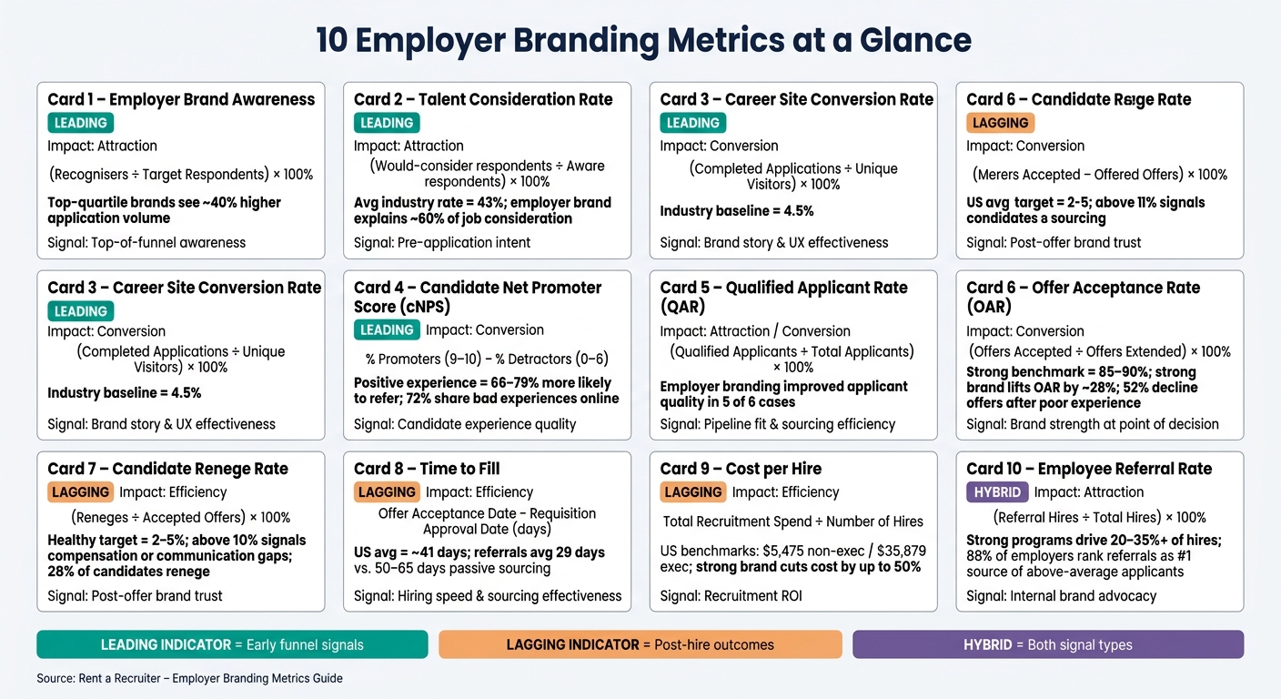
10 Employer Branding Metrics: Formulas, Benchmarks & Business Impact
Use this table to compare the 10 metrics quickly and standardise how your team defines each one.
| Metric | What It Measures | Formula | Type | Impact |
|---|---|---|---|---|
| Employer Brand Awareness | Target-candidate awareness of your company as an employer | (Respondents who recognise your company as an employer ÷ Total respondents in target talent segment) × 100% | Leading | Attraction |
| Talent Consideration Rate | Target-candidate intent to work for your company | (Respondents who would consider working for you ÷ Total respondents in target segment) × 100% | Leading | Attraction |
| Career Site Conversion Rate | Share of career site visitors who complete an application | (Completed applications ÷ Unique career site visitors) × 100% | Leading | Conversion |
| Candidate Net Promoter Score (cNPS) | Candidate experience and referral intent | % Promoters (9 to 10) minus % Detractors (0 to 6) from a post-process survey | Leading | Conversion |
| Qualified Applicant Rate | Share of applicants who meet minimum role criteria | (Applicants meeting minimum criteria ÷ Total applicants) × 100% | Leading | Attraction / Conversion |
| Offer Acceptance Rate | Share of extended offers accepted by candidates | (Offers accepted ÷ Offers extended) × 100% | Lagging | Conversion |
| Candidate Renege Rate | Share of accepted offers lost before day one | (Candidates who renege ÷ Offers accepted) × 100% | Lagging | Efficiency |
| Time to Fill | Average days from requisition approval to accepted offer | Sum of (Offer acceptance date – Requisition approval date) ÷ Number of filled roles | Lagging | Efficiency |
| Cost per Hire | Total recruitment spend per hire | Total recruitment costs ($) ÷ Number of hires in period | Lagging | Efficiency |
| Employee Referral Rate | Share of hires from employee referrals | (Referral hires ÷ Total hires) × 100% | Hybrid | Attraction |
Leading indicators help you spot early funnel shifts before they show up in hiring results. Lagging indicators tell you what happened after the fact, which matters, but by then you’ve often already lost time, budget, or strong applicants.
Treat the ranges as a starting point, then compare them against your own quarterly trend lines. That’s where the commercial value sits. If one metric drops while the rest stay steady, you’ve got a clearer view of where the funnel is leaking and where your team should act first.
Use these metrics to find the weakest stage in the funnel, then fix the part with the biggest effect on hiring speed, hiring cost, or offer conversion.
Using Employer Branding Metrics in a Scaling Hiring Function
Use these metrics to make weekly hiring decisions, not to fill a quarterly report. Once your dashboard is live, it should tell you what to fix this week. The waste isn’t in tracking metrics. It’s in tracking them and doing nothing with them.
For high-growth SMEs, each metric usually points to a clear business issue. If time to fill moves from 30 to 60 days for a key sales role, you’re likely looking at about four weeks of lost quota coverage. If offer acceptance rate falls below 80%, your compensation, interview experience, or employer brand messaging is out of step with candidate expectations. That’s your signal to act.
When the same bottleneck keeps showing up, structured support helps turn numbers into action. An embedded recruiter can standardize how requisitions are opened, how candidates are tracked, and how offer outcomes are logged, so your metrics reflect what’s actually happening rather than what’s missing from the system. Weekly hiring stand-ups built around live numbers, qualified applicant rate, pipeline volume, and time in stage, give you decisions instead of guesswork. Rent a Recruiter places experienced recruiters inside scaling teams across technology, SaaS, fintech, and engineering, often within days, and runs employer branding assessments, engagement surveys, and recruitment health checks to find the cause of weak metrics.
Use support when metrics slip and the cause isn’t obvious. If awareness is strong but career site conversion stays flat, the issue is likely your messaging or application flow. If qualified applicant rate looks healthy but offer acceptance is dropping, the problem is probably candidate experience or compensation.
Match the fix to the metric:
- Awareness gaps: improve messaging
- Conversion gaps: fix career site UX and application flow
- Offer-stage gaps: address process or compensation
Conclusion
Taken together, these metrics turn employer branding into a hiring system you can manage.
Track both perception and hiring outcomes. Awareness, consideration, and cNPS show brand health. Offer acceptance, time to fill, and cost per hire show business impact.
Once the dashboard is in place, the goal is not more metrics. It is consistent action.
Keep 5 to 7 core KPIs, review them monthly, and act on the patterns they show. A small, steady KPI set beats a large dashboard that nobody reviews properly.
Pay attention to how the metrics move together. If cNPS improves, does offer acceptance rise too? If career site conversion drops, does qualified applicant rate fall soon after? That’s where you find the bottleneck, not in the headline number alone.
Strong employer brands can increase qualified applicants and lower cost per hire. That’s why measurement matters. It helps you make faster, better hiring decisions and fix the part of the funnel that slows growth first.
FAQs
Which employer branding metrics matter most first?
Start with cNPS and eNPS.
cNPS shows how likely candidates are to recommend your hiring process. eNPS measures employee satisfaction and advocacy.
Together, they give you a fast read on two commercial pressure points: candidate experience and retention risk. If either score is weak, the cost tends to show up elsewhere, slower hiring, more drop-off, and more time spent replacing people you’ve already hired.
From there, widen the view. Look at candidate quality, offer acceptance rates, and brand awareness.
Candidate quality tells you whether your hiring work is bringing in people who can do the job and stay in the role. Offer acceptance rates show whether your pitch, package, and process are strong enough to close the right hires. Brand awareness helps you see whether the market knows who you are before your team even opens a role.
Put simply, these metrics help you spot what’s working, what’s leaking value, and where to focus next.
How often should we track these recruitment metrics?
Set a steady review cadence instead of changing course every time a weekly number moves.
For core hiring metrics, review cost-per-hire, time-to-fill, offer acceptance, retention, and referrals on a monthly or quarterly basis. That gives you enough data to spot patterns without getting pulled into noise.
For sentiment measures like eNPS and cNPS, a quarterly or twice-yearly review usually makes more sense. These numbers shift more slowly, so checking them too often can lead to bad reads and wasted time.
Your broader employer branding strategy should be reviewed once a year. That helps you keep it tied to business goals, hiring plans, and changes in the talent market.
What tools do we need to measure employer branding impact?
Use a mix of internal and external tools to track sentiment and hiring performance.
Internal tools like Google Forms, SurveyMonkey, or Qualtrics can help you measure eNPS, onboarding feedback, exit interviews, and cNPS. That gives you a clearer view of how people experience your hiring process and what happens after they join or leave.
Externally, use your ATS to track time-to-fill, cost-per-hire, and source-of-hire. Use Google Analytics to monitor career site traffic. Then keep an eye on review platforms like Glassdoor, Indeed, and LinkedIn to watch your reputation in the market.
Put simply, you need both sides of the picture: how people feel and how hiring performs. One shows perception. The other shows output. When you track both, you can spot issues earlier, cut wasted spend, and make better hiring calls.