
If you cannot see where hiring is slowing, what it costs, and which roles are at risk, you are making headcount decisions with partial data.
I’d boil this down to one point: a good recruitment analytics dashboard helps you cut delay, control spend, and make better hiring calls. For scaling SaaS, Technology, IT, Fintech, Engineering, Security, Insurance, and Professional Services teams, that means tracking a small set of metrics, splitting views by audience, connecting ATS, HRIS, interview, finance, and candidate feedback data, and putting rules around access, ownership, and update timing.
At a glance, the article shows you how to:
- Build separate views for recruiters, hiring managers, and executives
- Focus on 5 to 7 core metrics that lead to action
- Agree metric definitions early so teams trust the numbers
- Connect systems to link hiring speed, quality, and spend
- Use a simple layout with KPI cards, trends, and drill-downs
- Track funnel health through conversion, time in stage, and ageing roles
- Measure source performance by hire quality, volume, and cost
- Balance speed with outcomes like offer acceptance and quality of hire
- Segment results by department, role type, level, and recruiter
- Set governance rules for access, ownership, and update cadence
A few benchmarks stand out. Companies using advanced ATS and dashboard setups can cut time-to-hire by up to 30%. Open roles older than 60 days often need attention, while those past 90 days can hit delivery and revenue plans. Offer acceptance often lands around 75% to 81%, while 85% to 90% is a strong mark.
The core message is simple. Your dashboard should help you decide what to fix next, not just show activity. If you need to rate your recruitment process for more hiring structure and added delivery capacity, Rent a Recruiter can help you put that in place fast.
Build a Recruitment Dashboard in Power BI (Step-by-Step Guide)
For more expert insights, browse our recruitment video library.
sbb-itb-a23bd6a
Why Recruitment Dashboards Matter for High-Growth Startups
Many startups still choose between in-house talent vs recruitment agencies while running hiring through spreadsheets. That works for a while, then volume climbs and the whole thing starts to creak. Once you’re scaling, a recruitment dashboard stops being a nice-to-have and becomes the operating layer for hiring decisions.
Faster Decisions With Real-Time Hiring Data
A good dashboard should show open roles, stage flow, stalled candidates, and offer status straight away. When that data is live, your team doesn’t waste time chasing updates across email, Slack, and spreadsheets.
Companies using advanced ATS systems and recruitment dashboards can cut time-to-hire by up to 30%[2]. That’s not just a recruiting metric. It means less delay on revenue hires, less drag on team output, and less time lost to slow decision-making.
Real-time pipeline visibility also makes daily recruiter-manager stand-ups far more useful. Instead of trading opinions, you can make same-day decisions based on what’s actually happening in the funnel.
That same visibility makes slowdowns hard to miss.
Spotting Bottlenecks Across Hiring Stages
Dashboards show where candidates are getting stuck, not just where they are. That’s a big difference.
A funnel view helps you spot weak conversion rates and aging requisitions before they start hurting hiring output. If too many candidates drop off after first interview, or roles sit open too long without movement, you can see it early and act before the gap gets expensive. You can even use an embedded recruitment savings calculator to see how these inefficiencies impact your bottom line compared to more structured models.
Alerts and formatting should bring those bottlenecks to the surface fast. The point isn’t more reporting. The point is fixing issues before they slow down hiring targets.
Aligning Recruiters, Hiring Managers, and Leadership
Shared dashboards give recruiters, hiring managers, and leaders one version of hiring data. That cuts confusion, reduces back-and-forth, and keeps everyone focused on the same priorities and performance.
For scaling companies, that matters. When each group works from different numbers, hiring reviews turn into debates about the data instead of decisions about what to do next. A shared view keeps the conversation grounded and saves time across the business.
More Predictable Headcount Planning
Trend data helps leaders forecast fill times, set budget earlier, and plan sourcing capacity before gaps get bigger.
For CEOs, CFOs, and talent leaders, that’s where dashboards start to pay off beyond day-to-day recruiting. You’re not just looking at today’s pipeline. You’re getting a clearer view of future hiring pressure, likely delays, and where extra recruiter support may be needed.
With the case for dashboards established, the next step is defining what a good one should do.
What a Good Recruitment Analytics Dashboard Should Do
For high-growth tech teams, a good dashboard helps you make faster hiring decisions. It shows which roles need attention, where the process is getting stuck, and where recruiter time will have the biggest effect.
That only works if you track metrics that lead to action.
Show Metrics That Lead to Action
Choose metrics that trigger a clear next step. Before you add any number to the dashboard, ask a simple question: what would the team do differently if this moved? If the answer is nothing, leave it out.
Keep the dashboard centred on time-to-fill, time-in-stage, stage conversion rates, ageing requisitions, offer acceptance rate, and source quality. Each one should point to a clear action.
A role that has been open longer than normal can trigger a sourcing review. A drop in conversion after the technical screen can point to interviewer capacity issues or poor calibration.
The point is simple. A dashboard should help your team act, not just report.
Connect Hiring Speed, Quality, and Cost
Metrics only matter when they show the trade-offs. Looking at speed alone can send you in the wrong direction. A fast funnel that leads to more declined offers or fewer strong hires is not a win. It’s a problem, and your dashboard should make that plain.
Put speed metrics next to quality signals such as retention, hiring manager satisfaction, and post-onboarding performance, along with cost per hire by time period or department.[10][11][9]
When those three sit side by side, you get a much better view of hiring performance:
- Speed shows how fast roles move through the funnel
- Quality shows whether those hires work out
- Cost shows what that outcome is costing the business
That makes trade-offs easier to spot. It also helps you make sharper calls on process changes, recruiter workload, and budget.
Eliminate Metric Confusion
Even clear metrics fall apart if teams define them in different ways. If one team measures time-to-fill from requisition approval and another starts from the job posting date, hiring reviews turn into arguments about whose numbers are right.[10][2]
Use one shared definition for each metric, one source of data, and a clean dashboard layout. The definitions should stay the same across the business. What can change is the view, depending on the role looking at it.
That matters more than most teams think. Once everyone trusts the same numbers, conversations move faster. You stop debating the report and start dealing with the issue.
Support Recruiting Operations as Hiring Grows
As hiring grows, dashboards need to support a repeatable operating rhythm. More volume usually means more follow-up, more status chasing, and more room for confusion. A good dashboard cuts that manual work and gives the team a shared way to manage hiring. You can further streamline these workflows by using AI-powered recruitment tools to automate repetitive tasks.[3][11]
That means:
- fewer manual status updates
- clearer ownership of open roles
- faster decisions when headcount plans shift
Use the dashboard to standardise how your team tracks and manages hiring.
1. Build Separate Dashboard Views for Recruiters, Hiring Managers, and Executives
Once your essential recruitment metrics are set, the next step is simple: package them by audience.
Recruiters, hiring managers, and executives do not make the same decisions. So they should not be looking at the same dashboard.
If everyone gets one shared view, two things happen fast. The dashboard becomes cluttered, and people still end up asking for updates in Slack, email, or meetings. That slows hiring down and wastes time.
Operational Visibility
Each role works on a different time horizon. That means each one needs a different level of detail.
- Recruiter: daily actions, pipeline movement, and overdue follow-ups
- Hiring manager: role progress, candidate stage movement, and interview status
- Executive: hiring plan, cost, risks, and bottlenecks
Build three separate views, one for each audience, and tie each view to the decisions that person actually needs to make.
A recruiter needs to know what needs attention today. A hiring manager needs a clean view of where a role stands and what is blocking progress. An executive needs a high-level picture of hiring delivery, spend, and where the process is slowing down.
Decision Support Value
Role-based dashboards help people act faster.
They cut down on status-chasing. They reduce back-and-forth. And they let each stakeholder self-serve the data they need without digging through tabs that were never meant for them.
That has a direct business payoff: less admin, faster decisions, and fewer delays in the hiring process.
Startup Scalability
As hiring volume grows, one shared dashboard usually starts to crack.
Separate views make reporting easier to use at scale. Recruiters can handle more requisitions without losing track of daily priorities. Hiring managers can stay focused on delivery. Executives get clear oversight without getting buried in operational detail.
Each view should show only the metrics that matter to that audience. That keeps reporting clean, usable, and tied to hiring outcomes as volume grows.
2. Focus on Core Hiring Metrics That Drive Decisions
Once each stakeholder has their own view, keep the main dashboard tight. Stick to 5 to 7 metrics that shape repeat hiring decisions in fast-moving tech teams. Put everything else in secondary views.
A crowded dashboard slows people down. A focused one helps you act.
Decision Support Value
For most tech startups, the core metrics are time to fill, time in stage, offer acceptance rate, quality of hire, pipeline conversion rates, source quality, and cost per hire.
Each metric should earn its place. If you can’t say what decision it supports, it shouldn’t sit in the main view.
Take offer acceptance rate. If it drops, that should trigger a review of your hiring process, not just end up as another line in a report. The same rule applies across the board. A dashboard should help you decide what to fix, where to step in, and what to change next.
The next test is simple: does the metric show where the funnel is slowing down?
Operational Visibility
Operational metrics like time in stage and stage conversion rates show recruiters and hiring managers where candidates are getting stuck.
That’s where a lot of hiring drag starts. One delayed interview. One slow feedback loop. One bottleneck in approvals. It adds up fast, especially when you’re hiring across several roles at once.
When you track stage-level data in real time, you can spot problems before they hit time to fill or offer acceptance. That saves time, cuts waste, and helps your team keep momentum.
Use those stage-level signals to keep the dashboard lean and action-led.
Startup Scalability
Build filters for department, role type, level, and recruiter into every core metric from day one.
Why does that matter? Because top-line numbers can hide a mess underneath. A 30-day time to fill might look fine until you split it by function and see Engineering is taking 52 days while Sales is closing in 18.
Those filters give you a cleaner view of hiring performance as the business grows. They also make it much easier to spot where cost, delay, or drop-off is coming from, so you can fix the right problem instead of guessing.
3. Agree on Metric Definitions Before Building the Dashboard
Once you’ve picked your core metrics, lock the definitions before you build the dashboard. It sounds basic, but this is where a lot of recruitment dashboards fall apart.
If your team isn’t measuring the same thing in the same way, the dashboard turns into noise. People stop trusting the numbers, and once that happens, the dashboard stops helping anyone make decisions.
Data Reliability
Time to fill and time to hire are usually where confusion starts. If different teams use different definitions, the numbers can’t be compared, and trust disappears fast.
Document the start and end points, data source, owner, and calculation for every metric. Define time to fill as calendar days from requisition approval to offer acceptance. Cost per hire should be total internal and external recruitment costs divided by the number of hires in the period, including recruiter salaries, employer branding spend, and tools such as ATSs and sourcing platforms.
That level of clarity matters. If Finance is looking at one version of cost per hire and Talent is using another, you can’t judge spend properly. You also can’t see what’s working and what needs fixing.
With definitions fixed, the next step is connecting the systems that feed them.
Decision Support Value
Once consistency is in place, tie each metric to a business decision. A dashboard should do more than report activity. It should help you decide when to add recruiting capacity, which roles need process changes, and which sources are worth scaling.
Quality of hire is a good example. On its own, it’s often too vague to guide action. Define it as a composite score measured after ramp, blending manager performance ratings, progress on early objectives, and retention, and it becomes something your team can use. If that score drops in one department or from one source, you know where to look first.
That’s the difference between reporting and decision support. One tells you what happened. The other helps you act before hiring problems get more expensive.
Startup Scalability
Run a cross-functional metrics workshop before dashboard buildout. Bring together recruiters, hiring managers, finance, and ATS and HRIS admins, agree on definitions, and store them in a shared metric dictionary in a central internal wiki. As hiring expands, the dictionary becomes the source of truth.
This saves time later. As headcount grows, more people touch hiring data, more systems get involved, and small gaps in definition turn into bigger reporting problems. A shared metric dictionary keeps everyone aligned and cuts down on back-and-forth.
Once definitions are fixed, connect the systems that feed them.
4. Connect ATS, HRIS, Interview, Finance, and Candidate Experience Data
Once your definitions are clear, the next step is to connect the systems behind them. This is where many hiring dashboards start to drift off course.
Most recruiting teams work across several tools that were never built to talk to each other. Your ATS holds pipeline data. Your HRIS takes over after hire. Interview feedback may sit somewhere else. Finance data often lives in a separate system again. If those systems stay disconnected, your dashboard can look polished but still point you in the wrong direction.
Data Reliability
Set one source of truth for each data type. In most cases, that means the ATS owns recruiting data, while the HRIS owns employee data after hire.
Before you build any integration, create a field-mapping document. Keep it simple, but make it exact. It should list:
- every field you plan to sync
- which system each field comes from
- any transformation rules applied to that data
This matters more than most teams expect. If one system says "Sales", another says "Commercial", and a third says "Revenue", your reporting gets messy fast. The same goes for job families, locations, and status values. Standardize those labels early, then run checks for duplicates and missing records, or audit your recruitment health to identify deeper process gaps.
It may sound like admin work, but it protects decision-making. Bad data leads to bad hiring calls.
Decision Support Value
Once the data is clean and aligned, the dashboard stops being a reporting tool and starts helping you make better decisions.
Linking ATS and HRIS data lets you see which sources, interviewers, and role types lead to hires who stay and perform well. That changes the conversation. Instead of asking, "How many hires did we make?", you can ask, "Which parts of our hiring process are giving us the best return?"
Then bring in finance data. Add recruiting spend, total compensation, and cost per hire so you can compare hiring ROI by department. For CFOs and talent leaders, this is where the dashboard starts earning its keep. You’re no longer looking at hiring in isolation. You’re tying cost to outcome.
Candidate experience data adds another signal. If surveys are triggered at ATS events such as application, interview, offer, or hire, you can connect that feedback back to the recruiter, role, and stage where it was collected. That makes it much easier to spot trouble early.
For example, if candidate sentiment drops after panel interviews or during long assessment stages, you can fix the issue before it starts hurting offer acceptance. That saves time, protects employer brand, and helps keep hiring momentum up.
Startup Scalability
Start with the core link first: ATS and HRIS, usually through shared IDs like requisition ID and employee ID. After that, add interview scorecards and finance data in phase two.
Use native integrations where they exist. Where they don’t, iPaaS tools like Zapier, Make, or Workato can bridge the gaps through API connections. You do not need a huge data project on day one to get value from this.
Only 23% of organizations often or always integrate finance data with HR data [17][18], so even a basic finance connection can improve planning and reporting in a meaningful way.
As hiring volume grows and new tools get added, update your field-mapping document and keep your data-quality checks in place. The setup will change over time. That’s normal. What should not change is clear ownership and source-of-truth rules from the start.
5. Use a Clear Visual Layout With Top-Level KPIs and Trend Lines
Once your metrics are set, the next job is presentation.
Leaders should be able to scan the dashboard in seconds and know what needs attention. If the layout hides the signal, the dashboard fails.
Decision Support Value
The best recruitment dashboards follow a simple three-layer structure: 3 to 7 KPI cards at the top, trend lines in the middle, and detailed breakdowns below [20][21].
That top row should answer the first leadership question straight away: are we on track? This is where metrics like open requisitions, time to fill, offer acceptance rate, and pipeline conversion should sit. Each one should include a small trend marker so the number has context.
Trend lines show whether performance is moving in the right direction or slipping. When you pair each KPI card with a 6 or 12 month trend line, leadership gets both the current figure and the direction of travel needed for planning [4][22].
Operational Visibility
Put the main KPI in the top left. That’s where the eye goes first.
Use color with restraint. Green should mean on target, and red should mean off target. Keep that palette consistent across the dashboard so people don’t waste time decoding it or get distracted by visual clutter.
The middle section should focus on funnel charts and time-series views. These make it easy to see where candidates are moving through, or getting stuck in, the pipeline.
Below that, add tables and segmented breakdowns by department, role type, or recruiter. This gives your team the drill-down view without crowding the top of the page.
Startup Scalability
Build the layout in modules from the start.
As hiring expands across new teams or locations, the core structure stays the same while segmented views grow underneath it. That means you can scale reporting without a redesign. More importantly, it keeps the dashboard easy to read as hiring volume increases.
6. Track Pipeline Conversion Rates, Time in Stage, and Aging Requisitions
Once your top-line dashboard is in place, go a level deeper into the funnel metrics that show where hiring slows. Top-line KPIs tell you what is happening. These metrics help you see what to fix next.
Decision Support Value
Pipeline conversion rates show the share of candidates who move from one stage to the next. They help you spot where drop-off happens between steps. Compare each stage against common ranges, then look at the weakest point first.
Application to recruiter screening is typically 10% to 25%. Recruiter screening to hiring manager is usually 30% to 50%. Hiring manager to on-site or technical interview is often 50% to 70%. On-site or technical interview to offer tends to fall around 20% to 35%, and offer acceptance is usually 70% to 90%. [16][28][29]
If one stage sits well below those ranges, that’s your first signal. Maybe the brief is off. Maybe screening is too loose. Maybe interview standards vary from one manager to another. Either way, you’ve found the bottleneck.
Operational Visibility
Conversion tells you where candidates fall away. Time in stage tells you why.
Time in stage measures how many days a candidate spends in each step before moving forward. Track both average and median time in stage, and aim to keep active stages under 7 days. [16] For individual contributor roles, common targets include 3 to 7 business days from application to recruiter screening and 5 to 10 business days from final interview to offer decision. [28]
If time in stage jumps at the final decision point, the problem is often internal. Slow approvals or unclear scorecards tend to cause more delay than sourcing. That matters because the fix is different. You don’t solve an approval problem by adding more candidates.
A clear decision window after the final interview can shorten that step and reduce candidate drop-off.
Pair stage timing with requisition age so you can catch stuck roles before they hit hiring plans.
Aging requisitions round out the picture. Open roles that stay unfilled beyond 60 days are a warning sign. Roles open for more than 90 days often point to deeper issues, such as an unrealistic profile, a budget mismatch, or a process that the market won’t wait for. [8][30]
Your dashboard should flag these roles with conditional formatting and show a sortable table with:
- Role
- Department
- Recruiter
- Days open
- Stage
This is where hiring leaders, CFOs, and CEOs start to see commercial impact. A role sitting open for 90 days isn’t just an HR issue. It can slow product delivery, stretch team capacity, and delay revenue plans.
Startup Scalability
As hiring volume grows, these metrics move from useful to must-have. Conversion rates help you work backwards from hiring targets and estimate how many candidates you need at the top of the funnel. Time in stage shows whether interviewers and hiring managers have enough bandwidth to keep pace. Aging requisitions show which roles may block product roadmaps or revenue goals. [25][27]
Taken together, these metrics give you an early read on hiring drag. They help you spot pressure before it turns into missed headcount, wasted recruiter time, or delayed business plans.
7. Measure Source Performance by Hire Quality, Volume, and Cost
Source data tells you where to put more budget, and where to pull back.
Once you know where roles stall, the next step is simple: work out which channels keep producing hires you’d make again.
Decision Support Value
Judge each channel on three things: volume, quality, and cost. The point is not just to find the busiest source. It’s to find the sources that deliver the best hires for the lowest spend.
Cost per hire by source is the total source-specific spend, platform fees, recruiter time, agency commissions, and referral bonuses, divided by the number of hires from that source. SHRM‘s 2025 Benchmarking Report puts the average U.S. cost per hire for non-executive roles at $5,475. [34][35][37][38] If you’re spending anywhere near that, source-level tracking stops being a nice-to-have.
Quality of hire by source is usually measured as a weighted average of first-year performance rating, time-to-productivity, 12-month retention, and hiring manager satisfaction, then scored on a 0 to 100 scale. A low-cost source can still drain budget if those hires leave early. That’s why early attrition, within 90 days or 6 months, is a useful negative quality signal to track by source. [31][15][36]
Data Reliability
Make source a required field and use a controlled list. Then audit it every quarter to catch missing or mismatched records.
If people enter source data in free text, things go sideways fast. One recruiter writes "LinkedIn", another writes "LI", someone else writes "Linked In", and before long you’ve got a bloated "Not Specified" bucket that makes the whole report less useful.
Operational Visibility
Blended averages hide too much.
Filter source performance by role type, level, department, and recruiter so you can see what’s happening inside each part of the business. A source that works well for mid-level SaaS sales hires may fall flat for senior Engineering roles. If you only look at the average, you miss that.
The table below shows the core source metrics worth tracking side by side:
| Metric | What It Measures |
|---|---|
| Applicants per source | Reach and top-of-funnel volume |
| Apply-to-hire conversion rate | How well a source turns applicants into hires |
| Cost per hire by source | Total spend divided by hires from that channel |
| Quality-of-hire index | Weighted score: performance, retention, manager satisfaction |
| 90-day attrition by source | Early negative quality signal per channel |
| Time-to-fill by source | Days from requisition approval to accepted offer, segmented by source |
Track these metrics the same way every time. That gives you a cleaner basis for budget shifts, instead of relying on whoever shouts loudest about their favorite channel.
Startup Scalability
For early-stage teams, source tracking needs to work even when hiring volume is low, and still hold up as the company grows.
A simple approach works best:
- Limit active sources to channels you can track cleanly
- Set structured attribution from day one
- Review source performance monthly or quarterly
- Move budget based on what the data shows
As hiring volume grows, say from 10 to 100 hires per quarter, this discipline stops your dashboard turning into a pile of half-tracked spend and gut-feel decisions. [31][7][32]
If a source wins on volume but loses on quality, it should not get more budget. Reallocate spend only after you’ve checked the data against quality, acceptance, and retention.
8. Balance Speed Metrics With Quality of Hire and Offer Acceptance
After you review source performance, the next step is simple: did those hires actually work out? It is not enough to know where people came from. You need to know whether they stayed, performed well, and accepted the offer in the first place.
Speed matters. But quality of hire and offer acceptance tell you whether the process did its job.
That means putting hiring speed and hiring outcomes in the same view, so you can see the trade-offs clearly instead of looking at each metric in isolation.
Decision Support Value
Pair time-to-fill with offer acceptance and quality-of-hire data. Looking at these metrics together gives you a much better read on whether your hiring process is efficient or just fast on paper.
Research across more than 1 million interviews found that the best balance sits at 14 to 21 days. Processes completed in under 10 days saw 28% higher 6-month turnover. [40] SHRM research also suggests that each extra week of delay cuts offer acceptance probability by about 5% to 7% for competitive roles. [39]
That puts hiring leaders in a tight spot. Drag the process out, and you lose people. Push too hard, and you can lose them there too, especially if candidates feel rushed or underprepared.
A useful benchmark for tech hiring is 83% median offer acceptance, with top-quartile teams landing between 90% and 95%. [41]
Operational Visibility
Your overall time-to-fill can look fine while a deeper problem is building underneath. If offer acceptance starts to fall, something likely changed in compensation, candidate experience, or interview quality.
That is why segmentation matters. Break these metrics down by:
- role family
- seniority
- source
This helps you see where the issue sits, instead of treating hiring like a black box.
For quality of hire, keep the definition grounded in things you can track. A practical model includes hiring manager satisfaction, ramp time, 90-day or 6-month retention, role-specific goals, and early performance reviews, all scored in a consistent way across roles. [33][43]
Tie quality to measurable outcomes, not gut feel. That is where the dashboard becomes useful. It helps you judge when moving faster helps the business, and when it starts to cost you in retention, performance, or accepted offers.
9. Break Down Results by Department, Role Type, Level, and Recruiter
Once you can see overall funnel health, the next step is to cut the data by team and role. That’s where the useful detail starts to show up.
As hiring volume grows, averages blur the picture. A company-wide average can make things look fine when one function is slipping. Segment your dashboard by department, role type, level, and recruiter so you can see where performance starts to drift.
Decision Support Value
If senior engineering roles take 15 days longer to close and see lower offer acceptance than junior roles, that points to a segment-level issue in compensation, process, or sourcing. [45][44]
Recruiter-level views add another layer. Metrics such as time-to-first interview, interview-to-offer conversion, and average time in stage often differ from one recruiter to another. When you can see those gaps clearly, you can act on:
- Load balancing
- Coaching
- Interview calibration
- Sourcing changes
That matters because hiring delays rarely hit every team in the same way. One recruiter may be overloaded. One function may have a slow interview panel. One role type may need a different market approach.
Data Reliability
Only show recruiter-level comparisons when you have enough data to make the comparison fair. A good rule is at least 10 closed requisitions across a 3 to 6 month window.
And compare like with like. A recruiter hiring senior backend engineers should not be measured against someone running high-volume customer support hiring. Role complexity and department both affect cycle time, conversion, and close rate. If you skip that context, the dashboard can point people in the wrong direction.
Operational Visibility
Segmented views make it much easier to see which parts of the business are at risk of missing growth targets.
A filterable dashboard that shows ageing requisitions by department and level, such as open roles older than 45 days in Engineering versus Customer Success, alongside average time in stage for each segment, gives operations leaders a fast read on where interview scheduling or decision-making is slowing down. [46]
Role-type segmentation, such as technical versus non-technical or revenue-generating versus support, also shows which hiring categories need more sourcing spend or a simpler assessment process.
Use filterable tables and charts so users can compare departments, role types, levels, and recruiters without rebuilding the report. That saves time, cuts manual reporting, and makes it easier for each hiring owner to see where action is needed.
Use these segment views to spot the bottlenecks that need ownership and follow-up.
10. Set Refresh Cadence, Access Controls, and Dashboard Governance Rules
A dashboard only works when the data is current, controlled, and clearly owned. Once you’ve split views by audience, governance is what keeps those views accurate, secure, and consistent.
As hiring volume climbs, weak governance turns into a business problem fast. You get stale numbers, messy access, and slower decisions. None of that helps a CEO, CFO, or Talent Leader trying to hire at pace.
Data Reliability
Data quality is still one of the biggest blockers in HR analytics. Studies show that 68% to 74% of organisations report data quality issues, and 76% struggle with separate HR systems [48][49]. That’s not a small reporting issue. It’s a direct hit to hiring visibility.
Fix this before launch.
Create a data dictionary that sets out:
- who owns each field
- which source system it comes from
- how often it refreshes
Assign ATS, HRIS, and finance ownership to the fields each team controls. Make required fields mandatory before data reaches the dashboard. Give each KPI one clear owner.
If a definition changes, document it. Then run data quality checks before each refresh and tell stakeholders what the change means for historical comparisons. If you skip that step, your trend lines stop being useful, and confidence in the dashboard drops.
How Often Each View Should Refresh
Refresh cadence should match the decision cycle. Put simply, not every user needs the same speed.
| Dashboard View | Recommended Refresh | Main Use |
|---|---|---|
| Recruiter / Operational | Daily or near real-time | Pipeline prioritisation, candidate follow-up, requisition ageing |
| Hiring Manager | Weekly | Stage progression, interview scheduling, bottleneck review |
| Executive | Weekly or Monthly | Headcount vs. plan, cost trends, headcount forecasting |
Refreshing an executive dashboard every day sounds good on paper, but if leadership reviews it monthly, you’re adding cost without improving decisions. On the other hand, if a recruiter is working from pipeline data that is a week old, they may be chasing candidates who have already accepted another offer.
That’s the trade-off. Refresh speed should serve the decision, not the other way around.
Operational Visibility
Once cadence is set, the next step is control over who sees what. Role-based access control keeps sensitive hiring data in the right hands.
Recruiters need candidate-level detail for the roles they manage. Hiring managers need pipeline visibility for their own teams, not every department. Executives need rolled-up metrics such as headcount vs. plan, source effectiveness, and departmental performance, without seeing candidate notes or sensitive interview feedback.
Use row-level security so each person sees only the data they need. Turn on audit logging. Run periodic access reviews to catch access creep as the business grows.
This matters more than many teams think. Poor access control doesn’t just create risk. It also slows trust. If leaders aren’t sure who can edit, view, or pull hiring data, they start second-guessing the numbers.
Startup Scalability
As hiring volume grows, ad hoc dashboard edits can quietly chip away at trust. One extra metric here, one one-off access request there, one definition change nobody wrote down, and soon the dashboard stops feeling reliable.
A one-page dashboard policy helps avoid that. Cover refresh cadence, data ownership, access rules, and change control. Keep it simple, but make it clear.
That gives you something steady during hiring spikes, especially after funding rounds or periods of fast scale. Review the policy as teams grow, retire views nobody uses, and merge overlapping metrics so the dashboard stays useful instead of turning into clutter.
Recruitment Dashboard Metrics Comparison Table
Use only the metrics that change a hiring decision. As hiring volume grows, review them by role, department, and recruiter. That keeps the dashboard useful instead of turning it into a wall of numbers.
The table below links each metric to the decision it helps you make. For more templates and guides, visit our recruitment resources.
| Metric | Type | What It Measures | Decision It Supports | Benchmark (U.S.) |
|---|---|---|---|---|
| Time to Fill | Speed | Calendar days from requisition approval to offer acceptance | Adjust headcount planning, add interviewers, or expand sourcing for high-priority roles | 44 to 45 days median across all positions; tech roles are around 48 days [42][51] |
| Time to Hire | Speed | Calendar days from first contact with the candidate, such as application or outreach, to offer acceptance | Streamline interview stages, speed up feedback cycles, or use structured scorecards | 18 to 30 days for many professional roles [24] |
| Cost per Hire | Cost | Total internal and external recruiting costs divided by total hires, in USD | Allocate budget between internal recruiters, job ads, agency fees, and assessment tools; evaluate internal vs. external recruiting models | Varies widely by role and seniority; track the trend over time |
| Source Effectiveness | Cost / Quality | Hires, qualified pipeline, and quality outcomes by source, such as referrals, job boards, and outbound sourcing | Scale channels that deliver strong hires and reduce spend on sources with weak retention or low-quality pipeline | No single universal benchmark; compare hires, conversion, and retention by source over time |
| Offer Acceptance Rate | Conversion | Offers accepted divided by offers extended, multiplied by 100 | Adjust compensation bands, equity, remote policy, or how offers are communicated to candidates | 75% to 81% cross-industry average; 85% to 90% is strong [50][52][53] |
| Pipeline Volume | Volume / Funnel | Number of candidates at each stage of the funnel, plus stage-to-stage conversion | Increase top-of-funnel sourcing, loosen screening criteria, or shift target geographies | Application-to-interview conversion is typically around 3% to 10% [26][24] |
| Quality of Hire | Quality | Post-hire performance against expectations plus 12-month retention, sometimes combined with hiring manager satisfaction | Refine interview structure, competency definitions, assessment tools, or source mix | 75%+ of new hires meeting or exceeding expectations at 6 to 12 months [24] |
Two points matter most here. Time to Fill and Time to Hire are not the same thing, and cost should never sit on its own.
Time to Fill shows the full hiring timeline. That includes approval delays, recruiter activity, interview pacing, and internal sign-offs. If this number is high, the issue may not be sourcing alone. It may be slow decision-making inside the business.
Time to Hire is narrower. It shows how fast your team moves one person from first contact to accepted offer. This metric helps you spot friction in interview stages, feedback loops, and offer handling.
Cost needs the same level of context. A lower Cost per Hire can look good on paper, but not if it leads to longer vacancies or weaker hiring outcomes. Review it alongside Time to Fill so you do not save a few thousand dollars on sourcing while losing far more in delayed delivery, missed revenue, or extra pressure on your team.
Dashboard View Comparison by Stakeholder
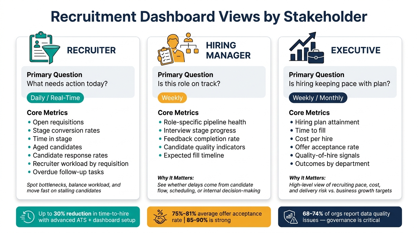
Recruitment Dashboard Views by Stakeholder: Metrics, Cadence & KPIs
The same hiring data should not be shown the same way to everyone.
Once your metric definitions and governance are set, each dashboard should be shaped around the decision that person needs to make. That keeps reporting useful, not noisy.
The table below shows the minimum view each stakeholder needs.
| Stakeholder | Primary Question | Core Metrics | Why It Matters | Refresh Cadence |
|---|---|---|---|---|
| Recruiter | What needs action today? | Open requisitions, stage conversion rates, time in stage, aged candidates, candidate response rates, recruiter workload by requisition, overdue follow-up tasks [6][5][19] | Helps recruiters spot bottlenecks, balance workload, and move fast on candidates who are stalling | Daily or real-time |
| Hiring Manager | Is this role on track? | Role-specific pipeline health, interview stage progress, feedback completion, candidate quality indicators, expected fill timeline [13][14][54][19] | Helps managers see whether delays are coming from candidate flow, scheduling, or internal decision-making | Weekly |
| Executive | Is hiring keeping pace with plan? | Hiring plan attainment, time to fill, cost per hire, offer acceptance rate, quality-of-hire signals, outcomes by department [12][5][1][19] | Gives leadership a high-level view of whether recruiting is keeping pace with business growth | Weekly or monthly |
Below is the minimum detail each audience needs.
Recruiter View
The recruiter view should start with open requisitions, stage conversion rates, time in stage, aged candidates, candidate response rates, recruiter workload by requisition, and overdue follow-up tasks.
This is the dashboard for today’s actions. If several candidates are sitting too long in the offer stage, the recruiter can step in fast with compensation alignment or closing steps. That saves time, cuts drift in the process, and lowers the risk of losing candidates late.
Keep this view alert-driven and tightly focused on what needs action now.
Hiring Manager View
The hiring manager view should focus on role-specific pipeline health. That means how many candidates are sitting in each stage, whether interview feedback is being submitted on time, and whether the role is still on pace to be filled as planned.
This matters because it shows where the delay sits. If feedback completion is low, the issue is internal, not a sourcing problem. That gives managers a clear line of sight into what they need to fix, instead of pushing blame back onto recruitment.
Executive View
The executive view should show no more than 5 to 7 outcome and risk metrics. That includes hiring plan attainment, time to fill, cost per hire, offer acceptance rate, and quality-of-hire signals.
For leadership teams, less is more. They do not need stage-by-stage detail. They need a clean view of whether hiring is on pace, what it is costing, and where delivery risk is building across departments. That makes it easier to tie recruiting performance back to headcount plans, budget control, and growth targets.
Keep each view limited to the metrics that drive that audience’s decisions.
Common Recruitment Dashboard Mistakes to Avoid
These mistakes are the other side of good dashboard design. They turn hiring data into noise, and they get much harder to fix as hiring volume grows. If you want a dashboard that helps leaders act, not just look busy, steer clear of the traps below. For more insights on optimizing your hiring process, explore our recruitment blog.
Tracking Too Many Metrics at Once
As hiring grows, teams often keep adding metrics and never take any away. Before long, the dashboard turns into a wall of numbers that nobody uses.
Keep each view to 5 to 7 metrics tied to a clear decision or next step. If a metric doesn’t lead to action, cut it. That one change makes dashboards easier to read and far more useful for CEOs, CFOs, and hiring leaders who need quick answers.
Using Inconsistent Metric Definitions
Small gaps in definitions can do a lot of damage. One team counts time-to-fill from approval date. Another counts from job launch. Suddenly, your trend line means different things in different places.
That breaks comparison across teams and time periods. It also chips away at leadership trust in the data.
Set each metric definition once. Record the data source. Store the rule set in a shared metric dictionary. If people don’t trust the numbers, they won’t use the dashboard.
Failing to Segment the Data
Blended averages can look neat, but they often hide the problem. A company-wide average might suggest hiring is on track, while one team is missing targets badly.
Add filters for department, role family, level, and recruiter to every default view. That lets users move from top-line numbers to a specific pipeline in one click. [11][23]
This matters because hiring problems rarely show up evenly across the business. They show up in pockets, and your dashboard should make those pockets easy to spot.
Prioritizing Speed Over Hire Quality
A dashboard that only shows time-to-fill pushes teams in the wrong direction. People start chasing speed instead of fit.
Put quality-of-hire and offer acceptance rate beside speed metrics. That gives a more balanced picture of hiring performance. Otherwise, teams end up optimizing for closure, not fit.
Fast hiring looks good on paper. Bad hires show up later in lost time, manager friction, and extra spend.
Refreshing Data Too Infrequently
A dashboard built on last month’s data can’t guide this week’s hiring calls. That’s where many teams get stuck. The dashboard exists, but it’s too old to help.
A simple cadence works well:
- Recruiter-facing views should refresh daily or close to real time
- Hiring manager views usually work on a weekly cycle
- Executive summaries can refresh weekly or every two weeks, but they should always show a visible last-refreshed timestamp [55][47]
Stale dashboards slow decision-making and weaken trust. If leaders have to ask whether the data is current, the dashboard is already losing value.
Conclusion
Once you put these dashboard practices in place, the test is pretty simple: does the dashboard help someone act on hiring data fast? The best dashboards stay tight, serve a clear audience, pull from connected data sources, and show the next step without guesswork. If a dashboard is not helping your team respond to a hiring issue fast enough to shift decisions, it is acting more like a report than a decision tool.
Focus on Metrics That Drive Action
Every metric on your dashboard should answer a real business question: where candidates are dropping out, which sources are producing quality hires, and how long it will take to fill the role. Keep each view to 3 to 7 core KPIs so it stays easy to read and built for action. That only works when each audience sees the metrics it can actually use.
Match Views to the People Using Them
Recruiters need pipeline movement. Hiring managers need role progress. Executives need headcount, cost, and risk. Put all of that into one view, and things get messy fast. Tailored views give you more clarity and help people make faster calls.
Design for Scale From the Start
As hiring volume grows, dashboards that were not built with governance in mind can become unreliable fast. Standardise metric definitions, data sources, and refresh cadence before hiring volume spikes. For scaling teams, the right dashboard only matters if the process behind it can grow with hiring.
For scaling teams, Rent a Recruiter embeds experienced recruiters in days to add structure, visibility, and hiring capacity.
FAQs
How do I choose the right hiring metrics?
Choose hiring metrics that tie straight to business results and show you where the funnel is doing its job, and where it’s leaking value.
Start with the Big Four:
- Cost-per-hire
- Time-to-fill, from job approval to accepted offer
- Offer acceptance rate
- 90-day retention
These give you a clear view of cost, speed, close rate, and early hire quality. For CEOs, CFOs, HR leaders, and Talent Leaders, that means a cleaner read on hiring spend, team capacity, and whether new hires are sticking.
Then go one level deeper with diagnostic metrics such as stage conversion rates, time in stage, and SLAs. For example, set a rule for feedback within 72 hours. That kind of visibility helps you spot delays fast. If candidates are getting stuck after interviews, or offers are being turned down, you’ll see it before the problem hits headcount plans.
Break your results down by role, source, team, and hiring manager. Without that split, the numbers can hide what’s going on. One team may be moving fast while another is losing good people in the final round. One source may look cheap but deliver poor retention.
Review conversion and time weekly, and check cost and quality monthly. Weekly reviews help you fix bottlenecks while roles are still live. Monthly reviews give you a steadier view of spend and hiring outcomes without overreacting to short-term noise.
What data sources should feed the dashboard?
Use connected data from your ATS, HRIS, and payroll systems to cut manual entry errors.
Pull in core data across the requisition, candidate, and performance/cost levels. That includes job details, source and stage data, offer outcomes, start dates, cost per hire in USD, 90-day retention, and hiring manager ratings.
Why does this matter? Because bad data creates bad hiring decisions. If your stage names don’t match, your timestamps are missing, or duplicate records slip in, your reporting gets messy fast. And when reporting is off, so are your cost, speed, and quality signals.
Run a monthly data audit to clean up:
- Duplicate records
- Inconsistent labels
- Missing timestamps
This gives you cleaner reporting, less admin, and a clearer view of what your hiring process is costing you.
How often should a recruitment dashboard refresh?
It depends on what you need the dashboard to do, and who relies on it.
For recruiter-facing operational dashboards, data should refresh in real time or at least hourly. That gives your team what they need for day-to-day prioritisation and fast action when bottlenecks show up.
For broader oversight, the rhythm shifts.
- Weekly reviews help you track pipeline health and spot stage-ageing alerts before they turn into missed hires.
- Monthly or quarterly reviews make more sense for higher-level metrics such as source effectiveness and headcount planning.
In plain terms, operational dashboards support daily execution. Strategic dashboards support hiring decisions tied to cost, capacity, and growth plans.