
Employee exits are a hiring cost problem, not just an HR metric. If you track the right retention numbers each month, you can spot where exits are building, cut backfill pressure, and tie turnover risk to dollars, recruiter workload, and headcount plans.
I’d keep the focus on three things:
- What has already happened: retention rate, turnover rate, voluntary turnover, involuntary turnover, and regrettable attrition
- What usually shifts before resignations: engagement trends, eNPS, response rates, absenteeism, performance dips, and manager changes
- Whether your risk model is useful: who gets flagged, how fast action happens, and how many flagged employees leave within 90 to 180 days
The commercial point is simple. If one team is running at 20% voluntary attrition, you are not just losing people. You are adding backfill cost, slowing delivery, and putting more pressure on hiring teams. With replacement costs often sitting at 90% to 200% of salary, even a small drop in regrettable attrition can save tens or hundreds of thousands of dollars over 12 months.
A simple monthly review should help you answer:
- Where are we losing people now?
- Which teams show early warning signs?
- Which exits hurt the business most?
- How much future hiring demand is retention risk creating?
- What would a 3% to 5% improvement save?
If you want retention reporting to support hiring and finance decisions, I’d use these metrics as a working scorecard, not a backward-looking report.
How to Keep Your Best Employees Happy and Engaged
sbb-itb-a23bd6a
Core retention and turnover metrics to track first
Start with the lagging metrics. These show you where turnover has already happened. Once you’ve set your baseline, focus first on the numbers that show actual employee loss.
Overall retention rate, turnover rate, and regrettable attrition
Track five numbers first: overall retention rate, overall turnover rate, voluntary turnover rate, involuntary turnover rate, and regrettable attrition.
Use the same formulas each time:
- Retention rate = employees who stayed ÷ employees at the start of the period
- Turnover rate = employees who left ÷ average headcount
Stick to one time window, whether that’s monthly, quarterly, or trailing 12 months. If you change the window from one report to the next, the numbers get messy fast.
Once those numbers are in place, add regrettable attrition. This is the metric that shows whether exits are causing real damage to the business. Two teams can post the same turnover rate and still face very different outcomes, depending on who walked out the door.
Define regrettable attrition using clear rules, such as performance ratings, critical-role status, or hard-to-fill skills. Report it as both a count and a percentage of total departures.
According to Mercer, the average U.S. voluntary turnover rate was 13.0% for 2024-2025[2], which gives you a useful benchmark to check whether your own baseline sits above or below the market.
Tenure stability: average tenure, median tenure, and first-year retention
Average tenure gives you a broad view of how long people stay, but it can be pulled up by a small group of long-serving employees. Median tenure is often the cleaner number because it shows what a typical employee is experiencing. Track both side by side so you can spot the gap.
First-year retention needs its own line in your review. One-third of turnover happens within the first year of employment[1], and sector benchmarks put first-year turnover at 25%-35%[3]. That has a direct cost. If people leave early, you lose hiring spend, manager time, onboarding effort, and team output.
Track 30-day, 90-day, 180-day, and 365-day retention as separate checkpoints. That level of detail matters. If 30-day retention looks steady but 90-day retention falls off, your onboarding may be working while manager support or workload starts to break down a few weeks later. Each checkpoint points to a different cause, and a different fix.
How to segment turnover data to find problem areas
Company-wide averages are a starting point, not an answer. Segment every turnover metric by manager, department, location, job level, function, tenure band, and critical role type to find hotspots.
Flag any segment running above the company average by a clear margin, and always show the percentage alongside the headcount. A 20% turnover rate means one thing in a team of 10 and something else in a function of 200.
Your goal is to see whether attrition is spread across the business or concentrated in one leader, one office, or one role type. That distinction matters because it changes where you spend time and budget. Once you’ve isolated the hotspots, move into the leading indicators and check the signals that tend to rise before exits happen.
Leading indicators that show risk before employees leave
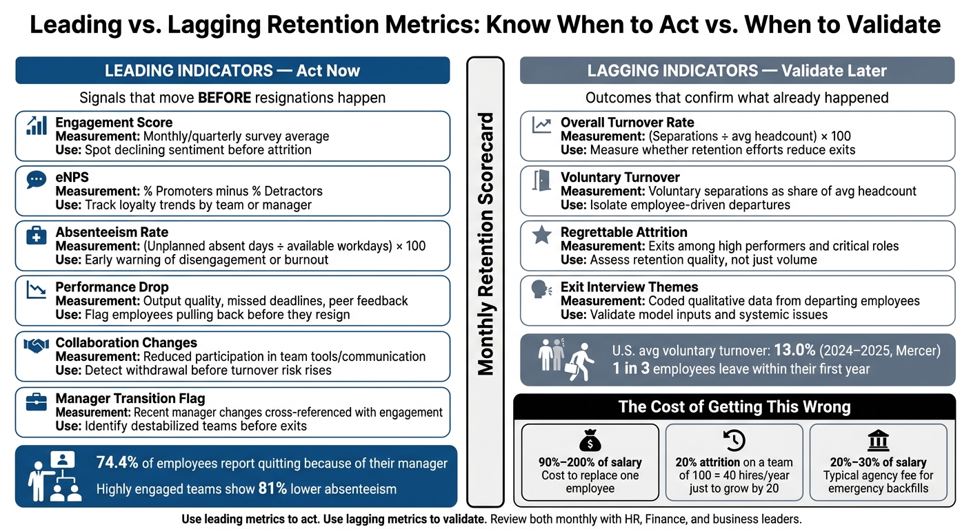
Leading vs. Lagging Retention Metrics: A Visual Scorecard
Lagging metrics tell you what has already happened. Leading indicators give you time to step in before an employee resigns and that risk shows up in your retention dashboard.
These signals often start moving weeks, or even months, before turnover data changes. That matters if you want to cut avoidable attrition, protect team output, and avoid the cost of backfilling roles and other challenges in recruitment.
Engagement score, eNPS, pulse trends, and response rate
Track engagement, eNPS, and pulse data as trends over time, not one-off snapshots. One low score on its own is less useful than a steady drop across several survey cycles, especially if that decline is concentrated in one team, job family, or manager group.
eNPS is calculated as % Promoters (scores 9–10) minus % Detractors (scores 0–6). Watch how it moves over time instead of reacting to a single number. Communication, support, and recognition are often among the strongest predictors of attrition intent inside engagement data.[7] Open-text comments can help you spot burnout, unclear priorities, weak recognition, and stalled career growth before those issues turn into exits.
Track survey response rate separately. If participation falls, dissatisfaction can be hidden even when headline scores look steady. Segment these trends by manager, department, location, and tenure band so you can see where risk is building.
Absenteeism, unplanned leave, and schedule adherence
Track absenteeism rate, unplanned leave frequency, and schedule adherence together. A simple formula is (unplanned absent days ÷ total available workdays) × 100.[8] Focus on change from each employee’s usual pattern, not isolated absences.
Highly engaged teams post 81% lower absenteeism than bottom-quartile teams,[6][10] which shows how closely attendance and engagement move together. In operations-heavy roles such as contact centers, logistics, and customer support, rising schedule adherence issues, missed shifts, and repeated short-notice callouts are some of the clearest early warnings of future attrition.[5]
Look at:
- Frequency
- Recency
- Clustering
That gives you a much better read than reacting to a single event.
Performance drops, collaboration changes, and manager transitions
Watch for declining output quality, missed deadlines, slower response times, and less participation in team routines or cross-functional work. These shifts are often gradual, which is why they make more sense when read alongside engagement and attendance data, not on their own.[4][5]
Research found that 74.4% of respondents reported quitting a job because of their manager,[9] so any manager change that lines up with falling engagement, lower collaboration, or higher absenteeism should be flagged fast. Supportive manager relationships reduce turnover intention, while pressure-based management styles increase it.[11][12]
When several indicators move at the same time, act straight away. That is usually the point where risk stops being theoretical and starts hitting team output, delivery, and hiring costs. To mitigate these risks, many companies transition to an embedded recruitment service to stabilize their hiring pipeline.
Use these signals to test whether your retention model is flagging risk early enough.
How to evaluate the retention risk model itself
Once you’re tracking retention, engagement, and absenteeism, the next step is simple: check whether the model gives you enough warning to do something useful.
That means looking at two things. First, does it flag the right people? Second, does it do so early enough for managers or HR to act before a resignation lands on your desk?
Flight-risk score and risk distribution
A retention risk score pulls together signals like engagement, tenure, absenteeism, performance, internal mobility, pay position, and manager changes into one composite score.
On its own, that score means very little. It only starts to matter when you connect it to clear action thresholds.
Set defined high-, medium-, and low-risk bands, then match each band to a specific response:
- High risk should trigger a documented intervention
- Medium risk should prompt a manager check-in
- Low risk should stay monitored, without dragging managers into extra admin
This matters because if too many employees sit in the high-risk band, the signal gets ignored. And once managers stop trusting the flag, the model stops helping.
Don’t stop at individual scores. Look at where risk is building up across the business. Break the distribution down by team, manager, tenure band, location, and role type. If the high-risk flags appear random, with no pattern by team or cohort, there’s a good chance the model is picking up noise instead of a useful signal.
For hiring leaders, this is where the commercial value becomes clear. If retention risk is clustering in one function, one manager group, or one location, you can spot where attrition is likely to become future hiring demand before it turns into a fire drill.
Intervention speed, success rate, and flagged vs. actual leavers
A risk flag is only useful if it leads to action in time.
Track time to intervention, meaning the number of days between a high-risk flag and a documented retention action. If the model identifies risk but the response takes weeks, you may be measuring risk without changing outcomes.
It also helps to compare turnover outcomes for flagged employees who received action versus those who didn’t. That gives you a clearer view of whether interventions are working, or whether the business is just logging activity.
Track flagged vs. actual leavers on a rolling basis, and quarterly is a good cadence. Look at two simple questions:
- What share of high-risk employees leave within 90 or 180 days?
- Of all employees who left, what share had been flagged in advance?
A model where 30% of high-risk employees leave within 180 days, compared to 5% of low-risk employees, is providing real directional value even if it’s far from perfect.[13]
You should also monitor precision, recall, false positives, and false negatives. Those measures help you judge how much noise the model creates, and whether it’s missing people who later leave. In plain terms, you want a model that gives your team enough warning to act, without flooding managers with alerts they stop taking seriously.
Leading vs. lagging metrics: a comparison table
The table below separates action metrics from outcome metrics. Use it as a monthly review guide: leading metrics for action, lagging metrics for validation.
| Metric | Type | How it’s measured | Primary use |
|---|---|---|---|
| Engagement score | Leading | Monthly or quarterly survey average | Spot declining sentiment before it becomes attrition |
| eNPS | Leading | % Promoters minus % Detractors | Track loyalty trends by team or manager |
| Absenteeism rate | Leading | (Unplanned absent days ÷ available workdays) × 100 | Early warning of disengagement or burnout |
| Performance drop | Leading | Output quality, missed deadlines, peer feedback trends | Flag employees pulling back before they resign |
| Collaboration changes | Leading | Reduced participation in collaboration tools or team communication trends | Detect withdrawal before turnover risk rises |
| Manager effectiveness or transition flag | Leading | Recent manager changes or declining manager effectiveness cross-referenced with engagement | Identify destabilized teams before exits occur |
| Overall turnover rate | Lagging | (Separations ÷ average headcount) × 100 | Measure whether retention efforts are reducing exits |
| Voluntary turnover | Lagging | Voluntary separations as a share of average headcount | Isolate employee-driven departures from layoffs |
| Regrettable attrition | Lagging | Exits among high performers and critical roles you would prefer to keep | Assess retention quality, not just volume |
| Exit interview themes | Lagging | Coded qualitative data from departing employees | Validate model inputs and identify systemic issues |
Lagging metrics matter for board reporting and annual planning, but they move too slowly to prevent exits on their own. Leading indicators help you act now. Lagging metrics tell you whether those actions are working quarter over quarter.
Used together, they give you a more grounded view of whether the model is helping the business hold onto key talent, cut avoidable attrition, and see where retention risk is likely to turn into hiring pressure next.
Turning retention metrics into hiring and cost decisions
Cost of turnover and its impact on workforce planning
Once retention risk is visible, the next step is to turn it into budget and hiring decisions.
Turnover often costs far more than most budgets allow for. SHRM-linked benchmarks put the total cost of replacing an employee at 90% to 200% of annual salary once you account for separation, vacancy, recruiting, onboarding, and the productivity gap during ramp-up.[16] That shifts retention from a simple HR KPI into a workforce planning and finance issue.
Cost of turnover = separation + vacancy + recruiting + onboarding + productivity loss.[14]
Put that into absolute dollars and as a percentage of payroll, and the conversation changes. Finance can see the cost clearly. Leaders can tie attrition to margin, hiring spend, and team output.
Turnover also warps headcount planning. A team of 100 with 20% annual voluntary attrition needs to hire 20 people just to stand still. Add a growth target of 20 more, and you’re now looking at 40 hires a year before the business has actually grown. That has a direct effect on recruiter capacity, budget, and delivery timelines.
Using retention data to reduce reactive hiring pressure
Cost data only matters if it changes when you hire.
If you can see where attrition is building, by team, tenure band, or manager, you can open roles before seats go empty instead of scrambling after a resignation lands. Historical patterns often show repeat spikes, like sales exits after bonus payouts or engineering exits in months 6 to 9.
That matters because emergency backfills are expensive. Agency fees in the U.S. usually sit at 20% to 30% of annual salary per placement.[15] Better retention visibility helps you cut how often you end up paying that premium. It also gives you a stronger case for earlier hiring plans and fewer last-minute backfills.
Conclusion: The retention metrics checklist to review every month
Pull these into one monthly review with HR, Finance, and business leaders:
- Turnover split: overall rate, voluntary, involuntary, regrettable
- Tenure checkpoints: first-year retention, median tenure, attrition by tenure band
- Segmented hotspots: attrition by department, manager, location, role type
- Engagement signals: eNPS, pulse scores, response rates
- Behavioral indicators: absenteeism, performance dips, manager transitions
- Risk model outputs: flight-risk distribution, intervention results
- Turnover cost: dollar estimate per role and as a percentage of payroll
The goal is a steady monthly review that ties retention health to hiring plans and cost control. You can also use a recruitment health check to identify other hidden inefficiencies in your talent strategy. If the review shows high regrettable attrition and rising agency spend in certain teams, model what a 3% to 5% retention improvement would save in replacement hires and recruiting costs over 12 months, then assess whether your current hiring model can handle that demand.
FAQs
Which retention metrics matter most first?
For small and medium-sized businesses, start with the Big Four: cost per hire, time to fill, offer acceptance rate, and 90-day retention.
These four metrics give you a clear baseline for how well your hiring is working.
They show you:
- Cost per hire, how much you’re spending to make each hire
- Time to fill, how long roles stay open
- Offer acceptance rate, how often top candidates say yes
- 90-day retention, whether new hires stick and perform after joining
Taken together, they help you measure hiring efficiency, market competitiveness, and quality of hire.
Once these are in place, you can add more detailed metrics like source of hire and candidate conversion rates. That gives you a better view of what’s working, where you’re losing time, and where bottlenecks are slowing hiring down.
How often should retention risk be reviewed?
Retention risk should generally be reviewed quarterly. It’s an outcome metric, not a day-to-day operating number, so it takes longer to show a clear pattern.
A quarterly review gives you enough time to spot trends, compare forecast retention against actual results, and adjust your hiring plan using the last 6 to 12 months of data.
How do retention metrics affect hiring costs?
Retention metrics, especially 90-day retention, show you something cost per hire often misses: the price of a bad start.
If a new hire leaves within the first three months, you may need to run the hiring process again. That can cost 30% to 50% of annual salary. For scaling teams, that’s not a small leak. It adds up fast.
Low retention can also signal issues beyond recruitment itself. In many cases, the problem sits in onboarding, role clarity, or early manager support. The result is the same: lost productivity, wasted spend, and more pressure on your team.
That’s why it makes sense to track retention alongside cost per hire. If you only focus on speed, you can fill roles fast but still lose money when people don’t stick.