
Poor candidate experience costs you hires, time, and money, long before it shows up in your final fill numbers.
If you lead hiring in SaaS, Technology, IT, Fintech, Engineering, Security, Insurance, or Professional Services, I’d track 10 metrics in one view: drop-off rate, completion rate, time to first contact, time to hire, time between updates, stage conversion, interview show rate, CSAT, cNPS, and offer acceptance rate. Together, they show where your funnel is leaking, where delays are building, and where weak communication is hurting hiring results.
A few numbers make the case fast. 59.7% of job seekers say employer ghosting is a major frustration, and 51% say poor communication made them abandon an application. That means bad process is not just a brand problem. It hits conversion, recruiter workload, hiring speed, and accepted offers.
Here’s the short version:
- Track behaviour metrics to see where people leave the process
- Track timing metrics to see where your team is slow
- Track sentiment metrics to see how the process lands
- Use medians and stage-level cuts, not just averages
- Segment by role, recruiter, location, and source so weak spots do not hide inside blended numbers
- Fix one friction point at a time, then measure again
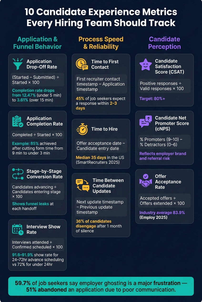
10 Candidate Experience Metrics Every Hiring Team Should Track
162: Tactical Tuesday – The Recruitment Metrics You Should Actually Care About ft. Vivien Maron
sbb-itb-a23bd6a
Quick Comparison
| Metric | What it tells you | Business impact if it slips |
|---|---|---|
| Application drop-off rate | Where applicants quit before submitting | Lost applicants from the same spend |
| Application completion rate | How many starters finish | Lower application yield |
| Time to first contact | How fast your team replies | Lower engagement, more drop-off |
| Time to hire | How long the process takes | Lost hires to other employers |
| Time between updates | Whether communication goes quiet | More withdrawals and weaker trust |
| Stage-by-stage conversion | Where the funnel weakens | Lower hiring output |
| Interview show rate | Whether scheduled interviews happen | Wasted hiring manager time |
| Candidate Satisfaction Score | How candidates rate the process | Early warning on process issues |
| Candidate Net Promoter Score | Whether people would recommend applying | Employer brand and referral risk |
| Offer acceptance rate | Whether offers turn into hires | Missed headcount and more backfill work |
For scaling teams, the point is simple: you do not need more reports, you need clearer signals tied to hiring outcomes. You can also watch our recruitment webinars for deeper dives into these metrics. That is what these 10 metrics give you.
What Makes Candidate Experience Metrics Useful
Once your definitions are set, the next step is to turn the numbers into something you can use. One metric on its own rarely tells the full story.
A low offer acceptance rate, for example, can point to slow communication, weak pay, unrealistic expectations, or a poor interview process. You can’t pin down the cause unless you look at timing data, decline reasons, and survey responses together. That means reading what candidates do, how long they wait, and how they rate the process as one picture, not three separate reports.
Combine behavior, speed, and feedback data
The most useful reporting brings together three inputs.
Behavior data shows where candidates move forward or leave the funnel, application completion, stage conversion, show rates, and offer acceptance.
Speed data shows how long candidates wait at each step, time to first contact, gaps between updates, and total time to hire.
Feedback data shows how candidates felt about those interactions, satisfaction scores, cNPS, and open-text comments.
Each one answers a different question. When you read them together, patterns are much easier to spot.
If interview show rates are falling and candidates say scheduling took more than a week, that’s a clear process issue. If offer acceptance is low but satisfaction scores stay strong, the problem is more likely pay or market position, not the hiring process itself.
This is where clean definitions matter. They turn raw hiring data into signals you can act on, where candidates drop off, where they wait, and where they lose interest.
Build a shared data dictionary
Before you report any metric, document the start point, end point, inclusions, and exclusions. Otherwise, teams end up debating the number instead of fixing the problem.
For example, "time to first contact" should state whether the clock starts at application submission and whether an automated confirmation email counts. "Time to hire" should state whether it runs from the application date or requisition approval, and whether it ends at offer acceptance or start date. You should also log exclusions such as duplicate applications, test records, internal candidates, and paused roles.
Give one person ownership of each definition. That keeps reporting clean and cuts down on confusion across Talent, HR, and leadership teams, especially when using an embedded recruitment service to manage these workflows.
| Data dictionary field | What to document |
|---|---|
| Start point | Timestamp when the measured process begins |
| End point | Timestamp when the measured process ends |
| Exclusions | Duplicate applications, test records, withdrawn applications before review |
| Refresh frequency | Daily for operational metrics; monthly for trend reporting |
| Owner | Recruiting operations or another named role |
| Action threshold | Escalation when the median exceeds the agreed SLA |
Pull from multiple data sources
Pull data from your ATS, scheduling tool, communication logs, offer records, and survey platform. Use one candidate or application ID to connect the data and avoid double counting.
Once that data is connected, the 10 metrics below are much easier to read and act on.
1. Application Drop-Off Rate
Start here. Application drop-off rate shows where people leave before your funnel gets any narrower. It measures the share of people who begin a job application but never submit it. That makes it one of the first signs that your process is adding friction you do not need.
The formula is simple:
Drop-off rate = (Applications started – Applications submitted) ÷ Applications started × 100
If 1,000 people start an application and 350 submit it, your drop-off rate is 65%. Pair this with application completion rate so you can see both sides of the picture: where you lose people and where they finish.
What this metric tells you depends on where people quit. Track abandonment by step to spot the biggest leak. Then compare mobile and desktop so you can tell the difference between a usability issue and a role-specific issue. If most exits happen right after people are asked to type in details already shown on their resume, that is a clear problem you can fix. Appcast data shows completion rates fall as application time rises, from 12.47% for applications taking under five minutes to just 3.61% for those taking more than 15 minutes.[4]
Go a level deeper and segment by device, source, role, and seniority. That helps you work out whether the issue sits with UX, traffic quality, or market fit. An overall 50% drop-off rate can hide a 30% desktop rate and an 80% mobile rate. Same headline number, very different commercial problem.
When the rate climbs, run a focused recruitment process audit:
- Find the step with the highest loss
- Recreate the application journey on the affected device or browser
- Test fixes such as removing duplicate fields, turning on resume parsing, removing forced account creation, or showing pay range and schedule up front
- Compare completion and drop-off rates after each change using similar candidate pools
That last part matters. A lower drop-off rate only helps if candidate quality stays steady. Otherwise, you are just making it easier to apply, not easier to hire well.
2. Application Completion Rate
If drop-off tells you where people leave, application completion rate tells you how many actually finish.
This metric shows the share of people who start an application and go on to submit it. A smoother process keeps people moving. A low rate usually points to friction: long forms, vague instructions, tech issues, or a poor mobile experience.
Application completion rate = Completed applications ÷ Started applications × 100
If 800 people start an application and 520 submit it, your completion rate is 65%.
The headline number only tells part of the story. A 65% overall rate can hide a 72% desktop completion rate and a 48% mobile rate. That usually points to a mobile usability issue. The same goes for source data. If employee referrals convert at 75% but one job board sits at 42%, that may signal a gap between the ad, the audience, or the landing page experience.
Segment by:
- Device
- Source
- Role
Those cuts help you work out whether the issue sits with UX, traffic quality, or one step in the application flow.
Recent examples show the same trend. In December 2024, Compass cut application completion time from more than nine minutes to under three minutes and reached an 85% overall application completion rate.[5] Shorter, simpler processes tend to get more applications over the line.
When this rate falls, treat it like a diagnostic signal. Find the exact step where people drop out. Then check for duplicate fields, extra required steps, and mobile issues. Fix one issue at a time and measure the result against a similar cohort.
For hiring leaders, this matters because every point of lost completion rate means fewer finished applications from the same spend. If you’re paying for traffic and sending candidates into a clunky process, you’re leaking value before your team even reviews a profile.
3. Time to First Contact
Once someone applies, the clock starts. Time to first contact tracks the gap between application submission and the first recruiter response, whether that’s an acknowledgment, a screening invite, or a message that shows the application has been reviewed and explains what happens next.
This metric tells you something simple but important: are people hearing from you fast enough to stay engaged? One note here matters. Track automated confirmations on their own. They do not count as first contact.
The formula is simple: Time to first contact = timestamp of first qualifying recruiter contact – application submission timestamp.
Report this as the median, not the average. If your response times are 4, 8, 12, 18, and 96 hours, the average is 27.6 hours, but the median is 12. That paints a much clearer picture of the usual experience. Add the 75th or 90th percentile alongside it so you can spot the longest waits, not just the middle of the pack.[7]
When the median starts creeping up, the issue is often operational. Common causes include:
- Recruiters carrying too much workload
- Unclear ownership of new applications
- Manual ATS steps slowing response time
- Poor routing rules
- Limited hiring capacity
This is where candidate experience turns into a business issue. CareerPlug‘s 2024 Candidate Experience Report found that 45% of job seekers expect a response within two to three days.[6] Separate U.S. research found that 31% of candidates reported waiting one to two months or longer without hearing back at all.[3] That’s not a small delay. That’s where interest fades, pipeline quality drops, and your team ends up paying for slow process with lower conversion.
Use this metric to set a clear SLA and an escalation path. A sensible starting point is to acknowledge applications within 24 hours and provide recruiter contact within 24 to 48 hours for priority openings. If the median misses target for two reports in a row, don’t jump straight to "reply faster". Look at recruiter workload, assignment rules, ATS alerts, and process bottlenecks first. In a lot of teams, slow first contact is just the first sign of a hiring system that’s slowing down all the way through. You can rate your recruitment process to identify where these bottlenecks are occurring.
4. Time to Hire
Fast first contact matters. But after that, the next test is simple: does the process keep moving?
Time to hire tracks the number of days from candidate entry to offer acceptance. When that number drifts up, you give people more time to lose interest, go quiet, or accept another offer.
It also helps to keep this separate from time to fill. Time to hire starts when the candidate enters the process. Time to fill starts when the requisition opens.
SmartRecruiters‘ 2025 data puts the median time to hire at 35 days in the United States.[8]
That top-line number only tells part of the story. If you want to cut delays, you need stage-level reporting. Break the metric into the points where hold-ups usually build:
- application or sourcing to recruiter review
- recruiter review to interview
- interview to final decision
- final decision to offer
- offer issued to acceptance
The total can hide where the real problem sits. A long cycle does not always mean the whole process is slow. Sometimes one stage is dragging everything down.
If the biggest delay shows up between the final interview and the offer, look closely at feedback deadlines, approval workflows, and decision-maker response time, or audit your recruitment health to find hidden bottlenecks. That is often where hiring teams lose momentum, and where strong candidates slip away.
Use the median alongside the 25th and 75th percentiles to show spread. That gives you a clearer picture of consistency, not just averages. A team with a decent median can still have too many roles stuck in slow-moving outliers.
Each slow stage needs its own fix. A blanket message to "hire faster" rarely changes anything. Instead, consider using AI-powered recruitment tools to automate repetitive tasks and reduce manual delays. Set clear targets for delays you can control, such as:
- recruiter review within one business day
- interview feedback within 24 to 48 hours
- offer approval within an agreed window
One note of caution. Speed matters, but not at any cost. Check candidate satisfaction before cutting steps. If you remove useful communication or assessment points, you may shorten the process on paper while hurting experience and lowering acceptance rates.
5. Time Between Candidate Updates
Once you’ve made first contact, the next test is simple: does communication stay steady, or does it drift?
Time between candidate updates tracks the gap between updates while an application is still active, after the first response. That includes acknowledgments, interview invites, status updates, and final decisions. When those gaps get too long, you’re not dealing with a minor admin issue. You’re looking at weak follow-through, often caused by a lack of recruitment as a service support to manage high-volume communication.
You can measure this in business days or calendar days, but pick one method and keep it consistent across teams. For reporting, focus on the median, the 90th percentile, and the longest gap. Averages can make things look better than they are.
Here’s why. Four candidates might see gaps of 1, 2, 2, and 14 business days. The average comes out to 4.75 days, which sounds acceptable at first glance. But the 14-day silence is the part that tells you something is off.
Stage-level tracking helps you find the problem faster. If the longest delays show up after interviews, the hold-up may be feedback collection. If they happen before interviews, the issue may sit with scheduling or screening capacity. That matters because delays don’t just hurt experience, they hurt hiring outcomes too. According to SHRM‘s summary of Talent Board research, 36% of U.S. candidates said they had not heard back from an employer one to two months after applying.[2] A 2024 Cronofy report found that 36% of candidates would disengage when interview scheduling reached the one-month mark.[9]
When a gap goes past your target, send a short update. Don’t leave the candidate guessing. A brief note saying the team is still completing interview feedback, the application is still under review, and the candidate will hear back by a specific date is far better than silence. It takes little time, and it protects trust in your process.
A simple operating rule can help:
- Set ATS alerts at three business days
- Escalate to the hiring lead at five business days
It’s also worth pairing this metric with candidate satisfaction data. Short gaps matter, but satisfaction data tells you whether the communication actually landed well. One metric shows where the process slipped. The other shows how much damage it caused.
6. Stage-by-Stage Conversion Rate
When candidate communication slows down, people don’t just wait forever. They drop out. Stage-by-stage conversion rate helps you see exactly where that happens.
Instead of looking at the funnel as one big number, this metric breaks hiring into each handoff: application to screen, screen to interview, interview to offer, and offer to acceptance. It shows how many candidates move forward at each step, so you can spot where momentum starts to fade.
The formula is simple:
Stage conversion rate = (Candidates entering the next stage ÷ Candidates entering the current stage) × 100[10]
For example, if 100 candidates reach a recruiter screen and 40 move to a hiring manager interview, your screen-to-interview conversion rate is 40%. Use the number entering the current stage as the denominator, not the full applicant pool.[10]
Here’s what that can look like in practice. A company with 500 completed applications might see:
- 100 recruiter screens, 20%
- 40 hiring manager interviews, 40%
- 20 final interviews, 50%
- 8 offers, 40%
This is where the metric earns its keep. It tells you where candidates are leaving. Then you dig into the reason.
A low conversion rate at one stage is not always a problem by itself. Sometimes it reflects a deliberate filter. But often, it points to process issues that cost you time and hiring output.
For example, a low screen-to-interview rate can suggest inconsistent fractional recruiter qualification criteria, or a gap between what recruiters are screening for and what hiring managers want. A low interview-to-offer rate can point to unclear evaluation criteria, too many interview rounds, or a job description that doesn’t match the role people are actually being assessed for.
Once you spot the weak step, check the operating data around that stage:
- How long candidates waited
- Why candidates were rejected or withdrew
- Whether interviewers used the same scorecards
- What candidate feedback said
If wait times are long, scorecards vary by interviewer, or feedback is thin, those issues usually show up in conversion numbers sooner or later. Used with timing and feedback data, stage conversion helps you find where hiring stalls, so you can fix the step that’s slowing the whole funnel.
7. Interview Show Rate
Once candidates reach the interview stage, the next question is simple: do they actually turn up?
Interview show rate measures the share of confirmed interviews that candidates attend:
(interviews attended ÷ confirmed interviews scheduled) × 100
This metric gives you a clear read on interview reliability. It also helps you spot wasted interviewer time, slowdowns in the hiring process, and gaps in candidate communication.
Track cancellations, reschedules, and no-shows as separate issues. That matters because they mean different things. A cancelled interview can often be recovered. An unexplained no-show, where the candidate does not attend and does not contact the team within 24 hours before or after the scheduled time, usually points to a communication gap or weak commitment.
Benchmarks change by role type. No-show rates are usually below 10% for professional roles and 20% to 30%+ for high-volume hourly hiring, but your own baseline matters most.[12] For hiring leaders, that baseline is the part worth watching. It tells you whether a drop in attendance is normal for your market or a sign that your process is leaking time and losing momentum.
One analysis found show rates of 91.6% for interviews scheduled 24 to 48 hours ahead and 91.9% for 48 to 72 hours ahead, versus 72.0% for interviews scheduled less than 24 hours ahead.[11] That’s a big drop. In plain terms, last-minute scheduling can hurt attendance more than most teams expect.
If no-shows bunch around short-notice interviews, give candidates more lead time and let them pick from a few slots. If video interviews are being missed, check the meeting link and make sure joining instructions are clear. Small fixes here can save your team hours of admin and protect interview capacity.
A few practical steps help:
- Use two-way confirmation
- Send a reminder 24 hours before
- Send a same-day reminder with the time zone, meeting link, and a clear rescheduling option[13]
Don’t look at show rate on its own. Pair it with time to first contact, time between updates, and candidate satisfaction data. That helps you work out whether the issue is just scheduling friction or part of a bigger engagement problem.
8. Candidate Satisfaction Score
Interview show rate tells you if people turn up. Candidate Satisfaction Score (CSAT) tells you how the candidate experience felt from their side.
CSAT measures how many candidates rate a stage, or the full hiring journey, positively based on survey responses. The formula is simple: positive responses ÷ valid responses × 100. You need to define what counts as "positive" before you report it. For example, on a 1 to 5 scale, that may mean ratings of 4 or 5. If 82 out of 100 respondents choose 4 or 5, your CSAT is 82%. A good baseline target is 80% or higher.[1] Put simply, CSAT gives you the candidate view of your hiring process.
Keep surveys short and tied to fixed points in the funnel. Send them after the application, screening, interviews, or offer stage. Stick to 4 to 5 questions, send them within 24 to 48 hours, and add one optional open-text question so people can flag issues that a rating alone won’t show.[15]
Report the response rate with the score every time. Otherwise, the number can paint a cleaner picture than reality. If most replies come from hired candidates, CSAT may look strong while rejected or withdrawn candidates had a poor experience. Low response rates can hide that problem. In one 2024 benchmark report, response rates were 50% for hired candidates, 22% for withdrawn candidates, and 21% for rejected candidates.[14] That’s why you should report:
- Invites sent
- Completions
- Valid responses
- Results by stage and outcome
Don’t rely on one blended average. It won’t tell you where things are going wrong.
CSAT also helps explain movement in your other hiring metrics. A process can look healthy on paper while sentiment is slipping underneath. Use CSAT alongside show rate, completion rate, and stage conversion to spot friction earlier. For example, strong interview show rates but weak interview CSAT may point to poor communication or weak interviewer performance. Low CSAT after an assessment can mean the process feels too heavy, even if candidates still move forward.[16]
Pay close attention to CSAT after interviews and offers. That’s often where weak sentiment starts to hit business outcomes, especially offer acceptance.
When CSAT drops, treat it as a process issue, not just a survey score. Set a threshold, such as a stage score below 80% or a drop of 5 percentage points from the previous quarter. Then assign an owner, review comments, fix the issue, and survey again.[15][17]
9. Candidate Net Promoter Score (cNPS)
If CSAT tells you whether candidates felt satisfied, Candidate Net Promoter Score (cNPS) tells you something different: whether they’d speak well of your hiring process to other people.
Ask: "Based on your experience with our hiring process, how likely are you to recommend applying to our company to someone you know?" Responses are scored from 0 to 10:
- Promoters: 9 to 10
- Passives: 7 to 8
- Detractors: 0 to 6
cNPS = % Promoters – % Detractors
That matters because advocacy has a direct link to employer brand, referral flow, and future applicant quality. A candidate can feel "fine" with the process and still not recommend it. That gap is where cNPS earns its place.
Unlike CSAT, cNPS shows whether candidates would actively recommend your process. It’s a sentiment signal, not a diagnosis. On its own, the number won’t tell you what broke. You need to read it alongside written feedback, stage conversion, update timing, and offer acceptance to understand what’s driving the score.
Scores often shift based on outcome, so segment by stage and rejection point.[19] That’s not a minor detail. Because cNPS reflects rejected and withdrawn candidates, not just hires, those groups give you the clearest view of advocacy risk.[18][20]
Always pair the score with an open-ended follow-up: "What is the main reason for your score?"[18] The score tells you how big the issue is. The comments tell you what to fix.
If the score drops, don’t file it away as survey admin. Treat it as a process signal. Pick one owner, assign one fix, set a deadline, and measure again. That’s how you turn candidate sentiment into better hiring outcomes, less brand damage, and fewer preventable drop-offs.
10. Offer Acceptance Rate
After candidate sentiment, this is the metric that tells you whether interest turns into hires. Offer acceptance rate is the percentage of formal offers sent that candidates accept.
Use this formula: (Number of accepted offers ÷ Number of offers extended) × 100. If you extend 20 offers and 17 candidates accept, your rate is 85% [23][21].
Consistency matters here. Count written offers formally sent during the reporting period, and track accepted, declined, withdrawn, and expired offers separately. That keeps pending offers from skewing the number.
The 2025 Employ Hiring Benchmark Report put the average at 83.9%, up from 82.5% in 2024 [22]. Benchmarks like this can help, but only up to a point. Methods and sample sizes vary, so your own trend line matters more than any market average.
When this rate drops, don’t assume it’s only about pay. A lower acceptance rate is a sign to dig into the reason. SHRM’s summary of CareerBuilder research found that 39% of candidates declined because they received another offer, 29% cited compensation and benefits below expectations, and 10% accepted a counteroffer from their current employer [24].
Those reasons do not point to one fix. They point to different problems:
- Another offer won first, which often means your process moved too slowly
- Compensation missed expectations, which points to pay band or offer alignment issues
- A counteroffer won, which usually means the candidate was not fully closed before the offer stage
In other words, slow process, weak positioning, and poor pre-closing can hurt acceptance just as much as compensation.
If acceptance is slipping, look closely at the gap between the final interview and the offer. Measure business days from final interview to offer sent. Track the median final-interview-to-offer time, and report the share of offers sent within two business days. Speed alone will not win every hire, but delays create space for other employers to step in. They also chip away at confidence in your process.
This is where many teams lose momentum. The interviews are done, everyone agrees on the candidate, and then the offer gets stuck in approvals. By the time it lands, the candidate’s energy has cooled off. In a busy hiring market, that gap can cost you.
When the offer stage slows or goes quiet, trust drops fast. Confirm compensation expectations, competing offers, notice periods, and decision factors before the final interview. Have the hiring manager make the offer call and explain why the candidate was selected. Then follow with a clear written offer that spells out total compensation, benefits, and growth opportunities.
Keep the process tight:
- One owner for the offer stage
- One SLA for offer turnaround
- One follow-up workflow so nothing gets missed
If offer-stage follow-through starts to slip during hiring spikes, embedded recruiting support like Rent a Recruiter can bring structure, visibility, and consistency.
How to Build a Hiring Dashboard From These Metrics
Group metrics by reporting purpose
Don’t dump all 10 metrics into one flat report. That usually gives you more noise than signal.
Instead, group each metric by the question it answers. A simple way to do that is to split them into three sets: behavior, speed, and sentiment.
| Reporting Group | Metrics | Core Question |
|---|---|---|
| Application & funnel behavior | Drop-off rate, completion rate, stage-by-stage conversion, interview show rate, offer acceptance rate | Where are candidates leaving or stalling? |
| Process speed & reliability | Time to first contact, time to hire, time between candidate updates | Where are delays happening, and who owns them? |
| Candidate perception | Candidate satisfaction score, cNPS | Which interactions are helping or hurting sentiment? |
This structure makes the dashboard easier to scan. It also helps leaders get to the business issue faster. If conversion is falling, you’re looking at funnel behavior. If roles are dragging on, you’re looking at speed. If offer acceptance or feedback dips, sentiment needs attention.
Show overall and segmented views
Once the metrics are grouped, put them into one dashboard with filters.
Show current values, period-over-period change, and targets for applicant volume, stage counts, completion rate, median time to hire, offer acceptance rate, and cNPS. Then let users filter by role, recruiter, department, source, and device.
This is where the dashboard becomes useful, not just neat. A high drop-off rate on its own tells you something is off. Filter by device or department, and now you can see where the issue sits. That’s what turns a metric into an action.
Use medians, ranges, and stage-level views
Use medians with percentile ranges to show the typical experience and the spread around it.[25]
That matters because averages can hide the mess. One slow role can skew the whole picture. Medians give you a cleaner read on what most candidates and hiring teams are dealing with.
Break the funnel into stage transitions. Show both conversion and median time at each step. That way, you can spot two different problems fast:
- low conversion between stages
- too much time sitting inside a stage
Both views should roll up into the at-a-glance table that follows.
Add hiring support when tracking capacity is limited
If your internal team is stretched, reporting is often the first thing to slip. Data goes stale. Updates get missed. Dashboards stop helping because no one trusts the numbers.
That’s where Rent a Recruiter can help. They can place experienced recruiters into your team fast, so hiring data stays current and reporting stays consistent.
When that tracking discipline is in place, the summary table below becomes much easier to read and act on.
Candidate Experience Metrics at a Glance
Summary table of all 10 metrics
Use the grouped dashboard above to scan this table faster. Treat it as a quick reference for each metric, what it means, and what to do next. For time-based metrics, use medians and segment results by role, location, recruiter, and source.
| Metric | Category | Formula / Data Source | What It Shows | Next Action |
|---|---|---|---|---|
| Application drop-off rate | Application behavior | (Abandoned applications ÷ applications started) × 100; ATS and application analytics | Shows where candidates leave before submitting, including the form step with the most exits | Remove extra fields, simplify instructions, improve mobile usability, and test the step with the highest drop-off |
| Application completion rate | Application behavior | (Completed applications ÷ applications started) × 100; ATS and careers-site analytics | Shows how many starters finish. If this rate falls, friction is building in the workflow | Review required questions, CV parsing, and account-creation steps |
| Time to first contact | Process speed | First recruiter contact timestamp − application timestamp; ATS records and communication logs | Shows how fast your team responds after a candidate applies. A wide spread often points to slow triage or unclear ownership | Set a response-time SLA, for example, initial outreach within two business days, and monitor exceptions by recruiter and role |
| Time to hire | Process speed | Offer acceptance date − candidate entry date (application or sourcing date); ATS offer records | Shows overall recruitment speed from candidate entry to accepted offer | Run a stage-level review of screening, interviews, approvals, and offer preparation when the median rises |
| Time between candidate updates | Process speed | Next candidate-update timestamp − previous candidate-update timestamp; ATS status changes and email logs | Shows whether candidates are being kept informed between steps | Assign communication ownership at each handoff and use automated status reminders to close gaps |
| Stage-by-stage conversion rate | Stage progression | (Candidates advancing to next stage ÷ candidates entering the stage) × 100; ATS stage histories | Shows where candidates stall or leave the funnel, from application to screen, screen to interview, interview to offer, and offer to acceptance | Review job description accuracy, screening criteria, interview consistency, and candidate instructions at the stage where conversion drops |
| Interview show rate | Attendance | (Completed interviews ÷ scheduled interviews) × 100; calendar, video-conferencing, and ATS records | Shows how many scheduled interviews candidates attend. A low rate can point to weak scheduling or friction earlier in the process | Simplify scheduling, confirm time zones, send reminders, and track no-shows separately from employer cancellations |
| Candidate satisfaction score (CSAT) | Candidate perception | Positive responses ÷ valid responses × 100; usually measured on a 1–5 scale; survey platform data | Shows how candidates rate a specific interaction, such as a recruiter call, interview, or rejection notice | Review open-text comments by stage and assign an owner to each recurring issue that comes up |
| Candidate Net Promoter Score (cNPS) | Candidate perception | (% of promoters scoring 9–10) − (% of detractors scoring 0–6); candidate surveys | Shows willingness to recommend your hiring process. It reflects brand impact beyond one interaction | Review communication quality, transparency, and rejection handling when the score is negative or falling; report response count, because small samples can skew the score |
| Offer acceptance rate | Offer outcome | (Accepted offers ÷ total offers extended) × 100; ATS offer records | Shows whether candidates say yes once an offer is made. A low rate can point to pay misalignment, slow approvals, or expectation gaps | Run structured decline interviews, review offer turnaround time and pay competitiveness, and check that the job matches the role described |
With the metrics grouped and defined, the final step is using them to fix the process, as seen in our embedded recruitment case studies.
Conclusion
Once the dashboard is built, the next step is action.
No single metric tells you the whole story. A high offer acceptance rate can still hide a weak funnel. You might see decent hiring outcomes on paper while candidates are dropping off, waiting too long, or leaving with a poor impression.
The full picture comes from pairing outcomes with the experience behind them.
Track behavior and feedback together
Use the 10 metrics together, not on their own. Behavioral metrics show where candidates drop out. Sentiment metrics show where the experience starts to fail. For example, slow responses point to a communication problem that time-to-hire data on its own can miss.
Pair each process metric with a perception measure for the same stage and time window. If the time between updates goes up and satisfaction with communication falls at the same time, the link is hard to ignore. That makes it much easier to decide what to fix first.
Use findings to revamp your recruitment process
Use a simple loop: measure, fix one friction point, remeasure.
If mobile applicants abandon the application more often than desktop users, shorten the form and test it on a phone. If cNPS is negative despite a reasonable time to hire, the issue likely sits in communication quality or fairness concerns, not speed.
When your team lacks the bandwidth to act, Rent a Recruiter can help keep hiring moving. They place experienced recruiters directly inside your team to manage hiring end-to-end.
That is what these metrics should drive. A hiring process that feels timely, clear, and respectful.
FAQs
Which candidate experience metrics should I prioritize first?
Start with a funnel audit so you can see where candidates drop off.
Prioritize these core metrics first:
- Application completion rate
- Time-to-first-contact
- Offer acceptance rate
These metrics show you where friction is building and where your process is slowing hiring down. That matters because every delay can mean lost candidates, more admin time, and a higher cost per hire.
Once those numbers are steady, add Candidate Net Promoter Score (cNPS) to track overall satisfaction and sentiment.
How often should I review candidate experience metrics?
Use a tiered review cycle so you can manage the hiring process in the moment, while still keeping an eye on bigger patterns and planning.
- Weekly: feedback turnaround, rejection feedback, time in stage, and drop-off rates
- Monthly: cNPS, survey response rates, would-apply-again rates, application-to-hire ratios, and offer acceptance rates
- Quarterly: silver medalist rehire rates, interviewer calibration, and overall process health
This cadence helps you spot issues early, fix friction before it slows hiring, and make better decisions about process, recruiter capacity, and interview quality.
What’s the best way to benchmark these metrics?
Start with your own past hiring data. That gives you a clear baseline. From there, compare your numbers against common market targets.
For example:
- Aim for a Candidate Net Promoter Score (cNPS) of 50+
- Target application completion rates of 70% to 80%
These numbers help you see if your hiring process is working well, or if it is costing you time, applicants, and hiring momentum.
Your Applicant Tracking System should do more than store applicants. Use it to track stage-to-stage conversion rates, flag bottlenecks, and show where drop-off happens.
Review this data monthly or quarterly. That makes it easier to spot patterns early, fix weak points, and keep your process moving in the right direction.